Sydney Kings NBL26
‘Built for Sydney’
Position: Creative Lead
Role: Creative Direction / Brand Systems / Graphic Design / Motion / Uniform & Merchandise Design / OOH / Template Systems
Studio: Total Sport + Entertainment
For the Sydney Kings’ NBL26 season, I served as Creative Lead for the third consecutive season, overseeing creative direction and hands-on delivery across the club’s physical, digital and live touchpoints.
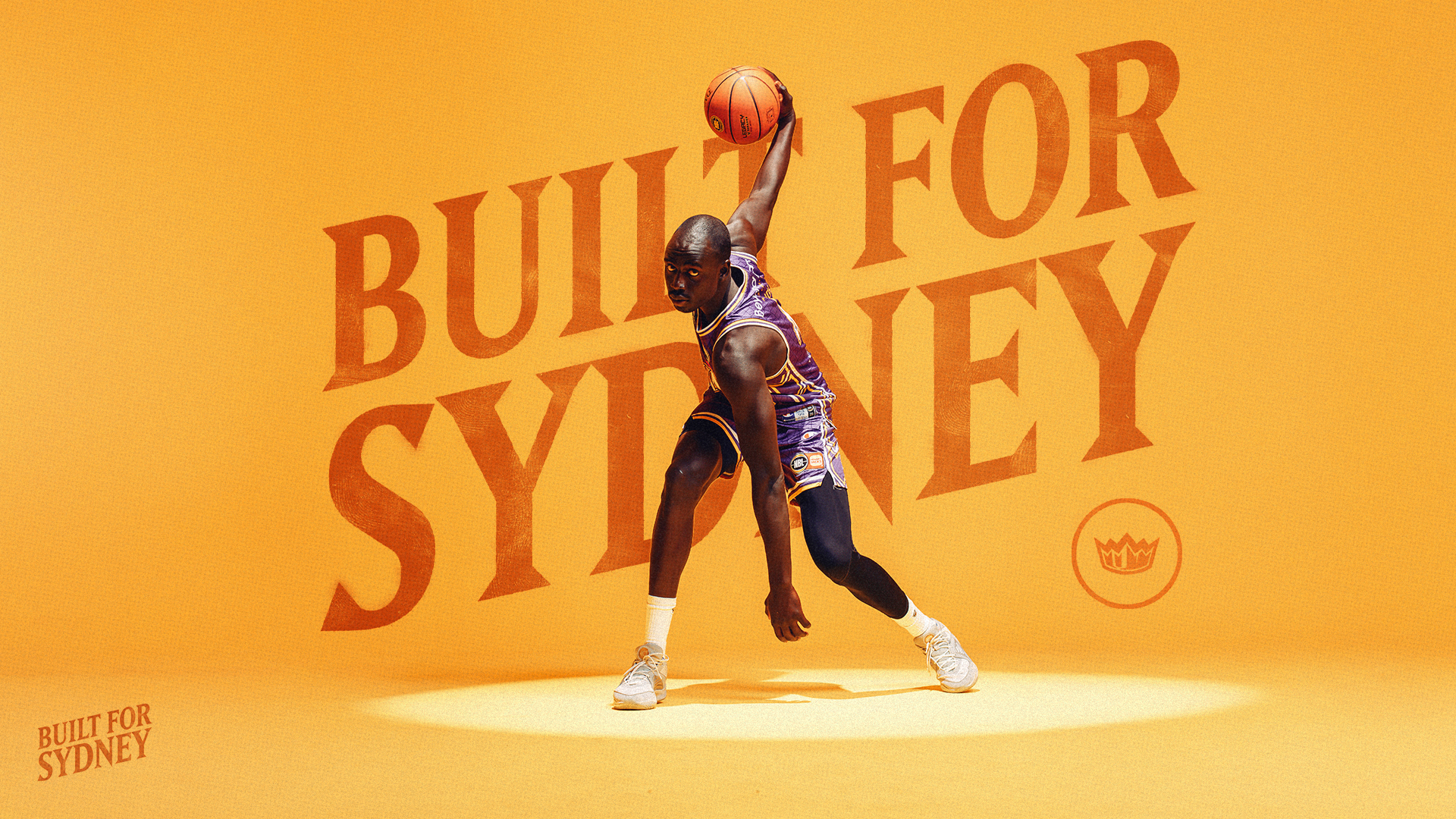
‘Built for Sydney’ was established as the club’s season-long campaign platform. The original visual direction was built around a complete photo and video media day shot against a yellow backdrop, providing a bold and consistent foundation for the season’s social and marketing creative.
A change in stakeholder direction at season launch required the ongoing social system to pivot while live delivery was already underway. I led the initial creative territory along with the re-alignment and continued delivering the club’s social design output.
Content approved at initial campaign launch such as uniforms, merchandise, membership, signage and game-day motion remained unchanged.
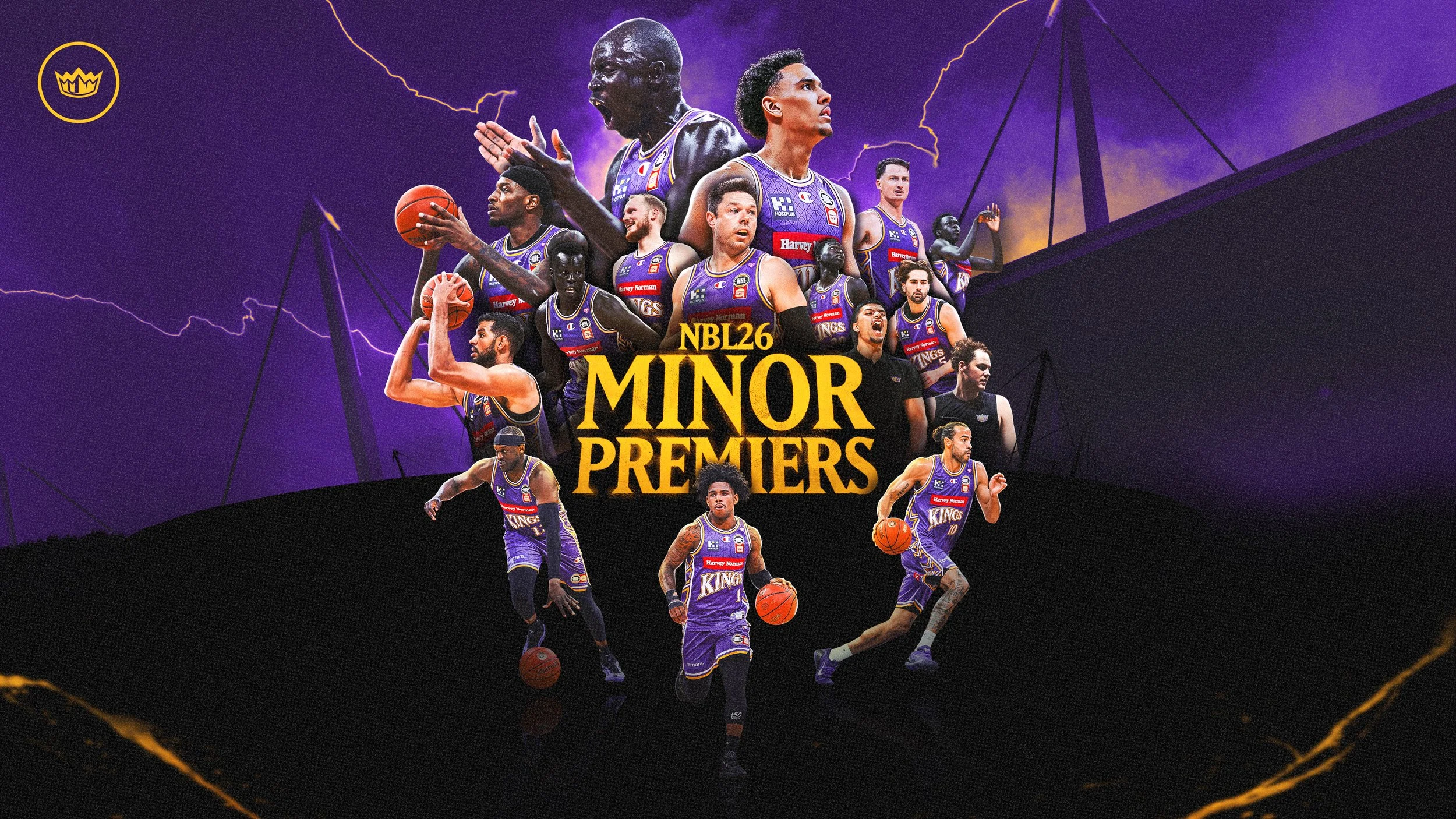
For the NBL26 Finals, I developed a revised creative territory that consolidated the updated direction into a distinct and cohesive postseason campaign.
Initial Campaign Identity
*Kings In-Venue Runout video - Produced by Total Sport + Entertainment
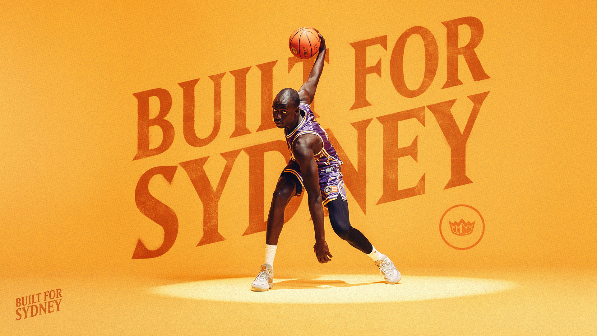
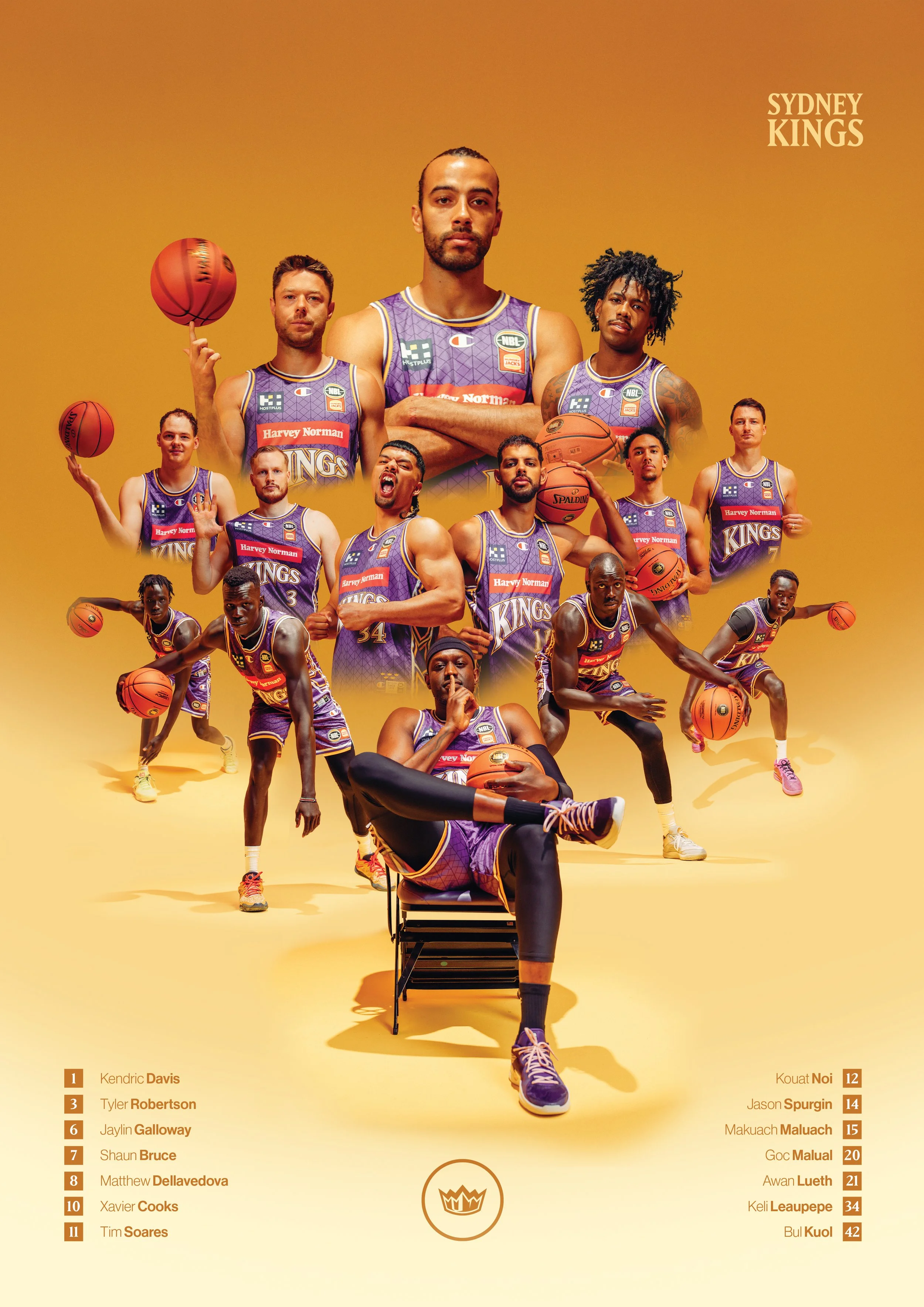
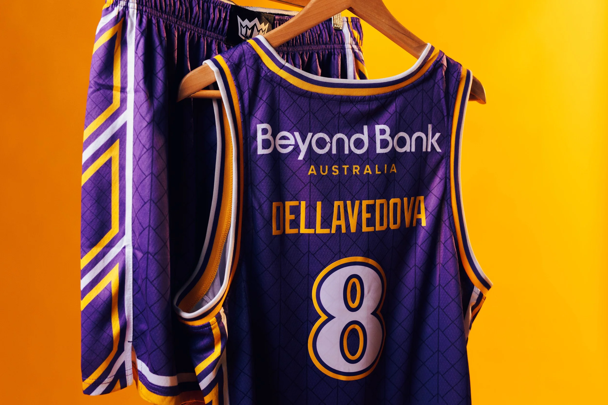
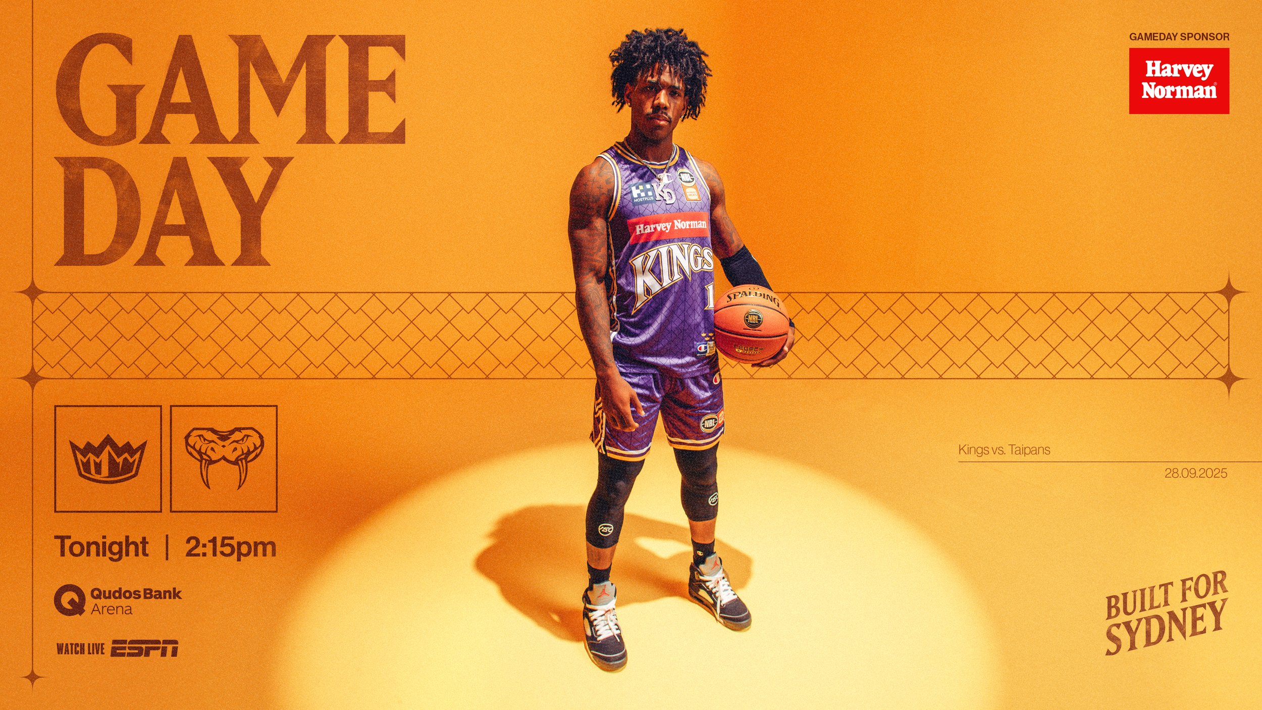
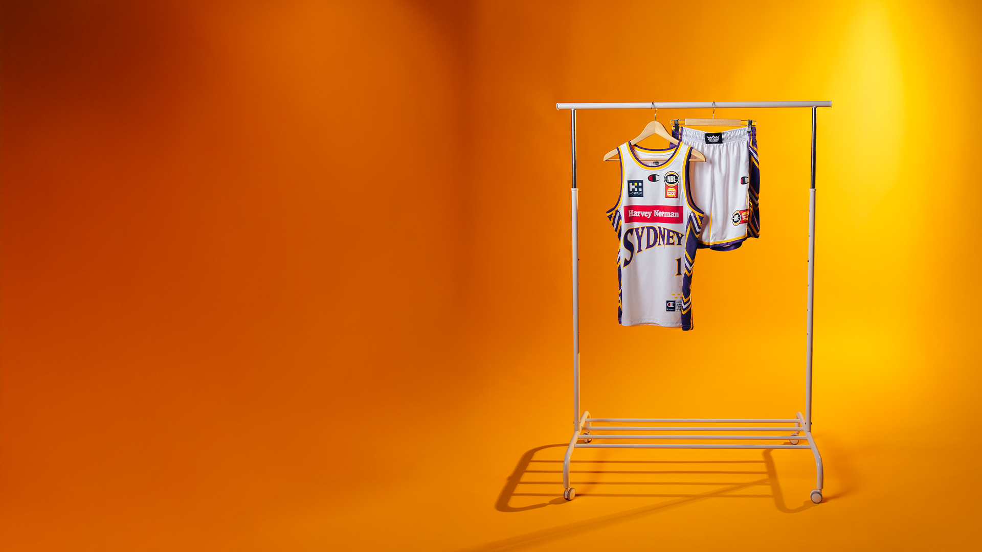

The original ‘Built for Sydney’ direction centred around the yellow Media day backdrop - using one of the club’s core colours as the foundation for a bold and immediately recognisable campaign system.
The direction was developed in tandem with the Uniform design to create continuity across season-long social, marketing and campaign outputs while remaining connected to the broader Sydney Kings identity.
*Kings In-Venue Player Introduction - Produced by Total Sport + Entertainment, Motion and venue rollout by me
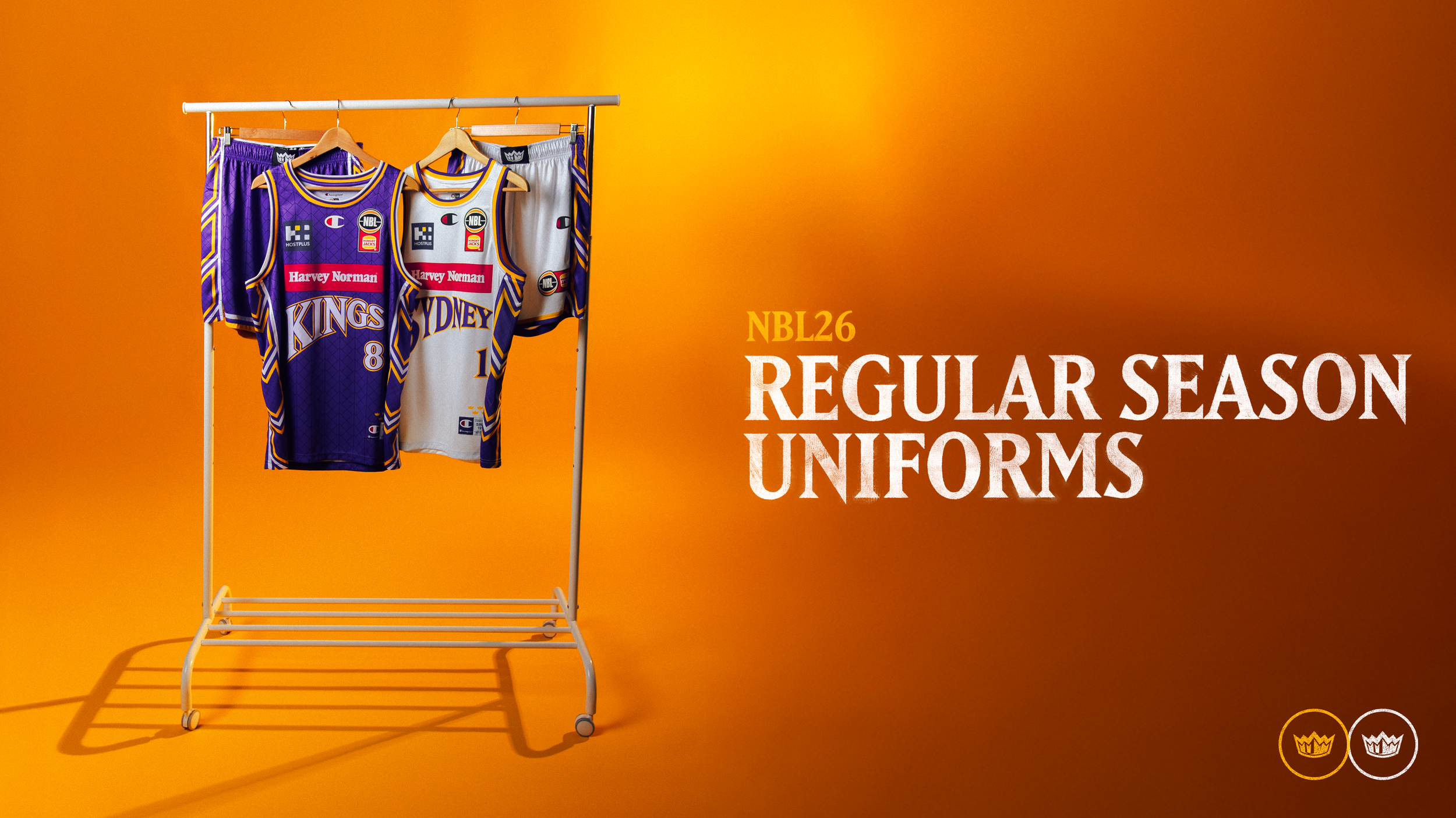
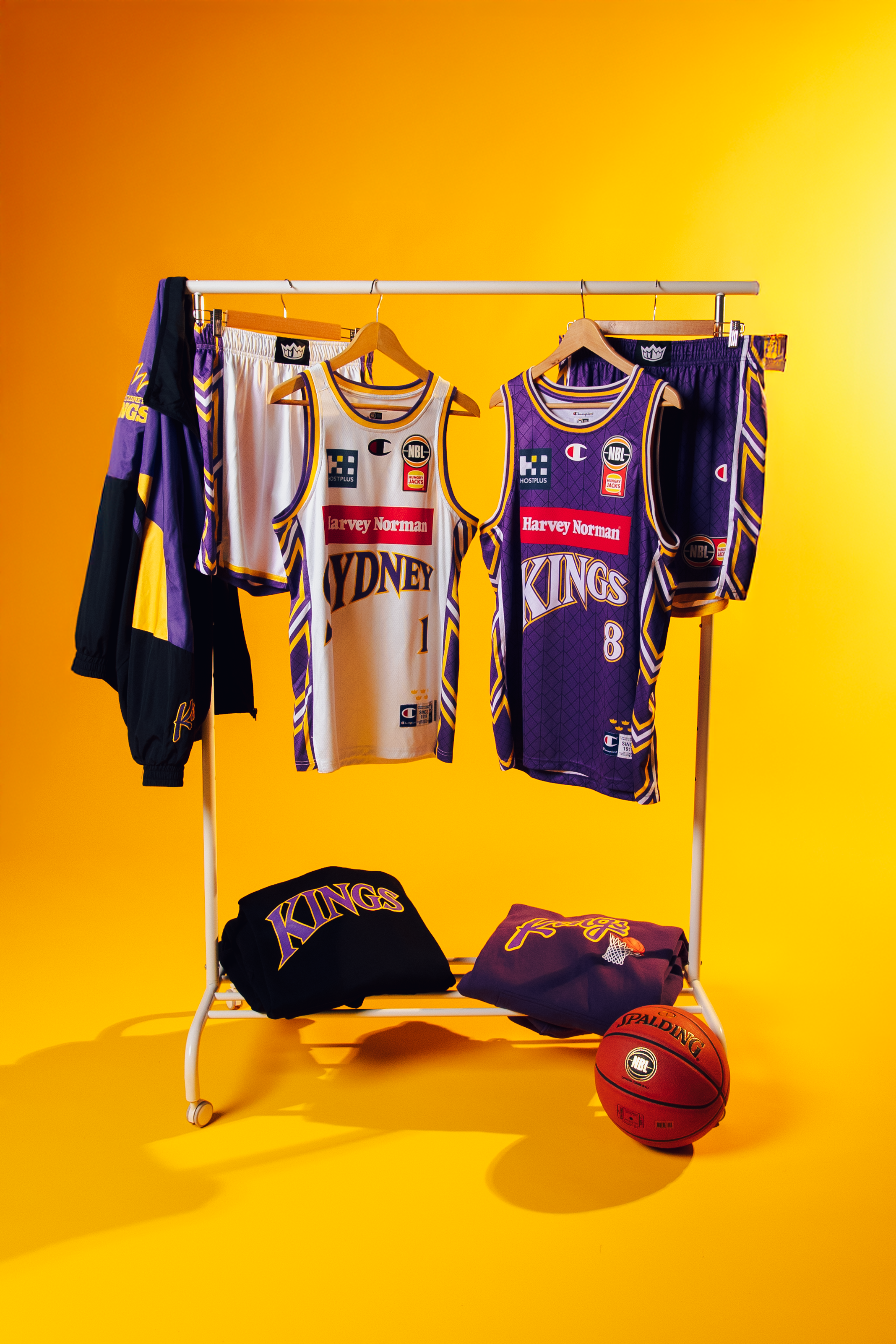
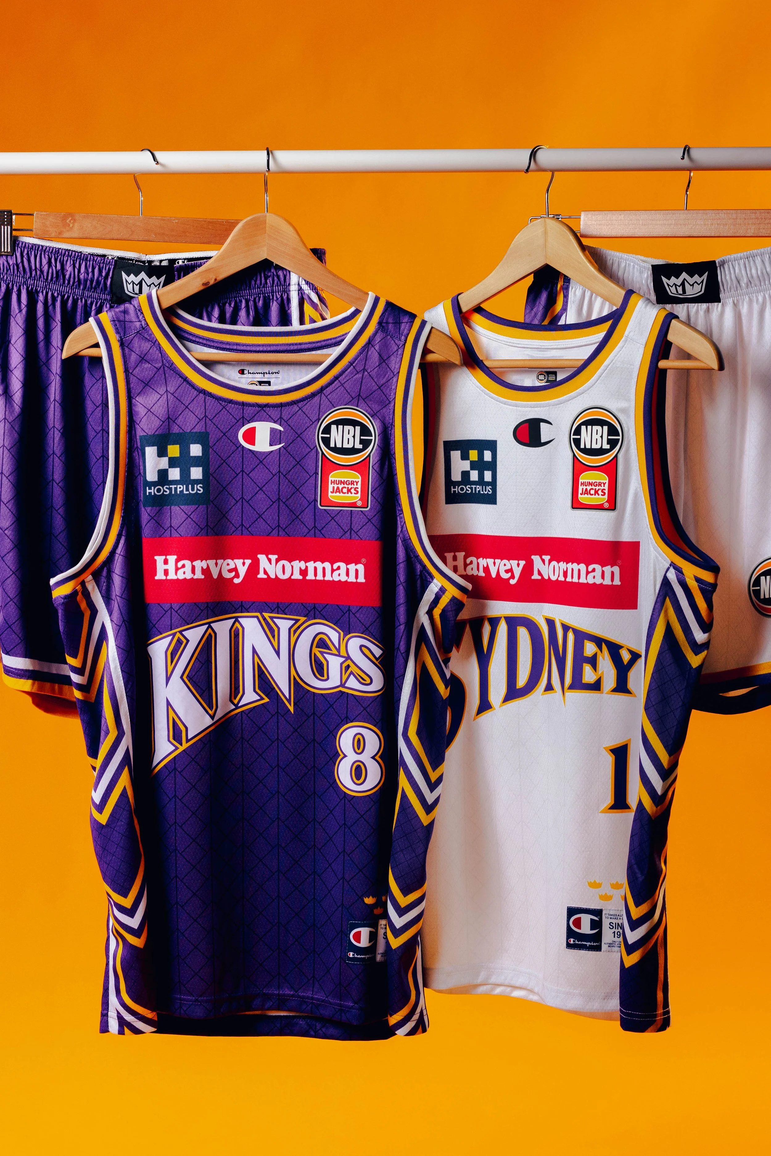
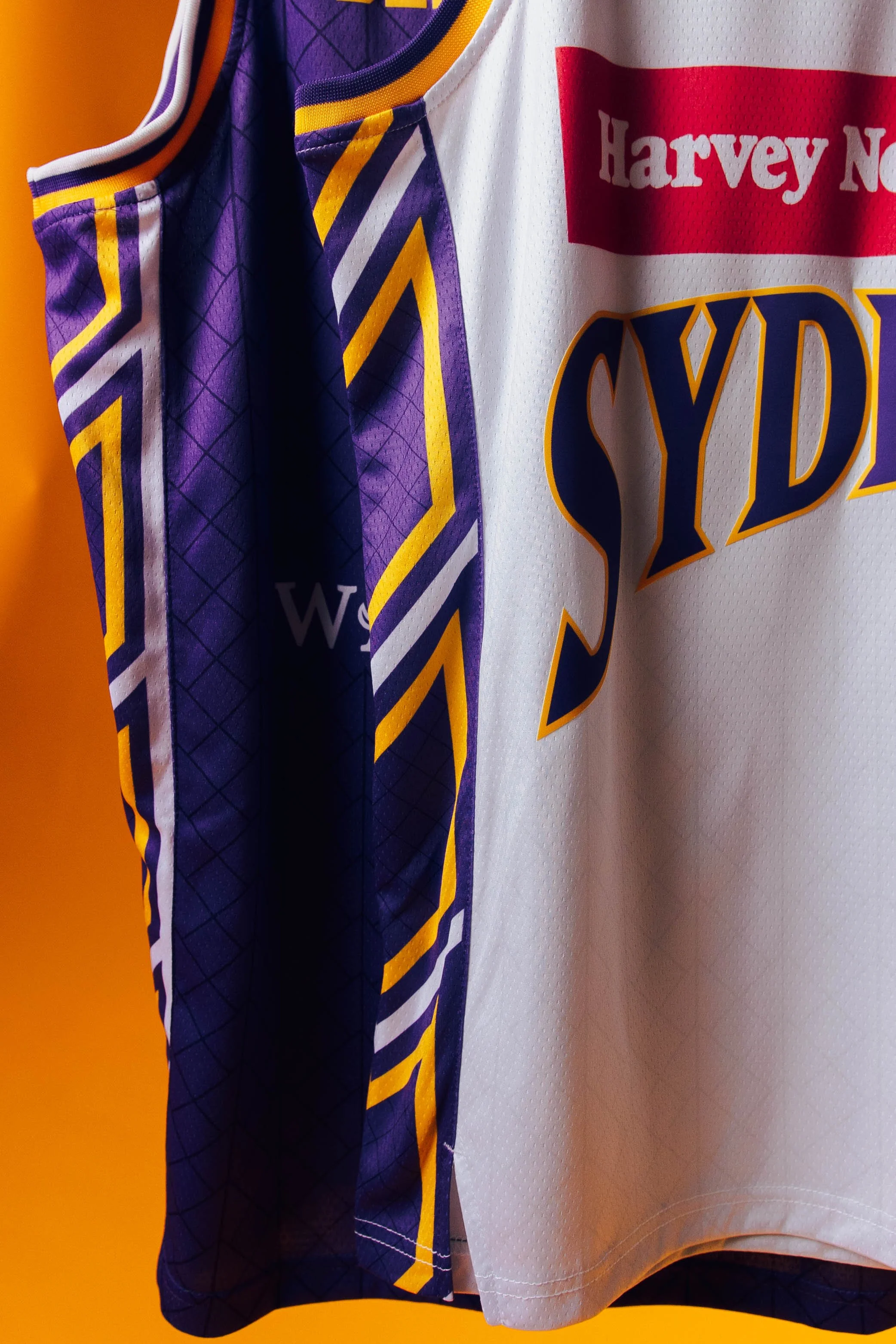
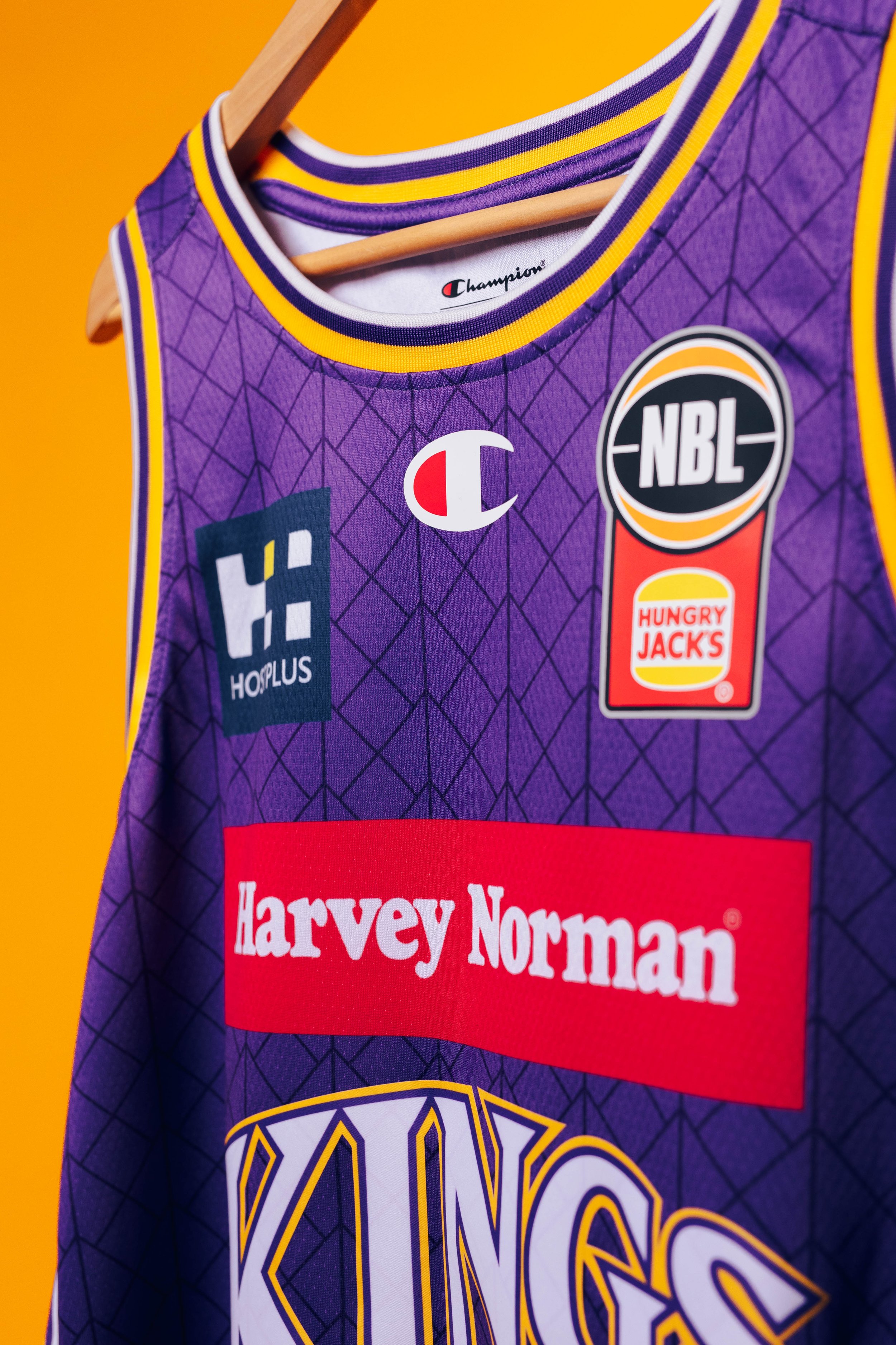
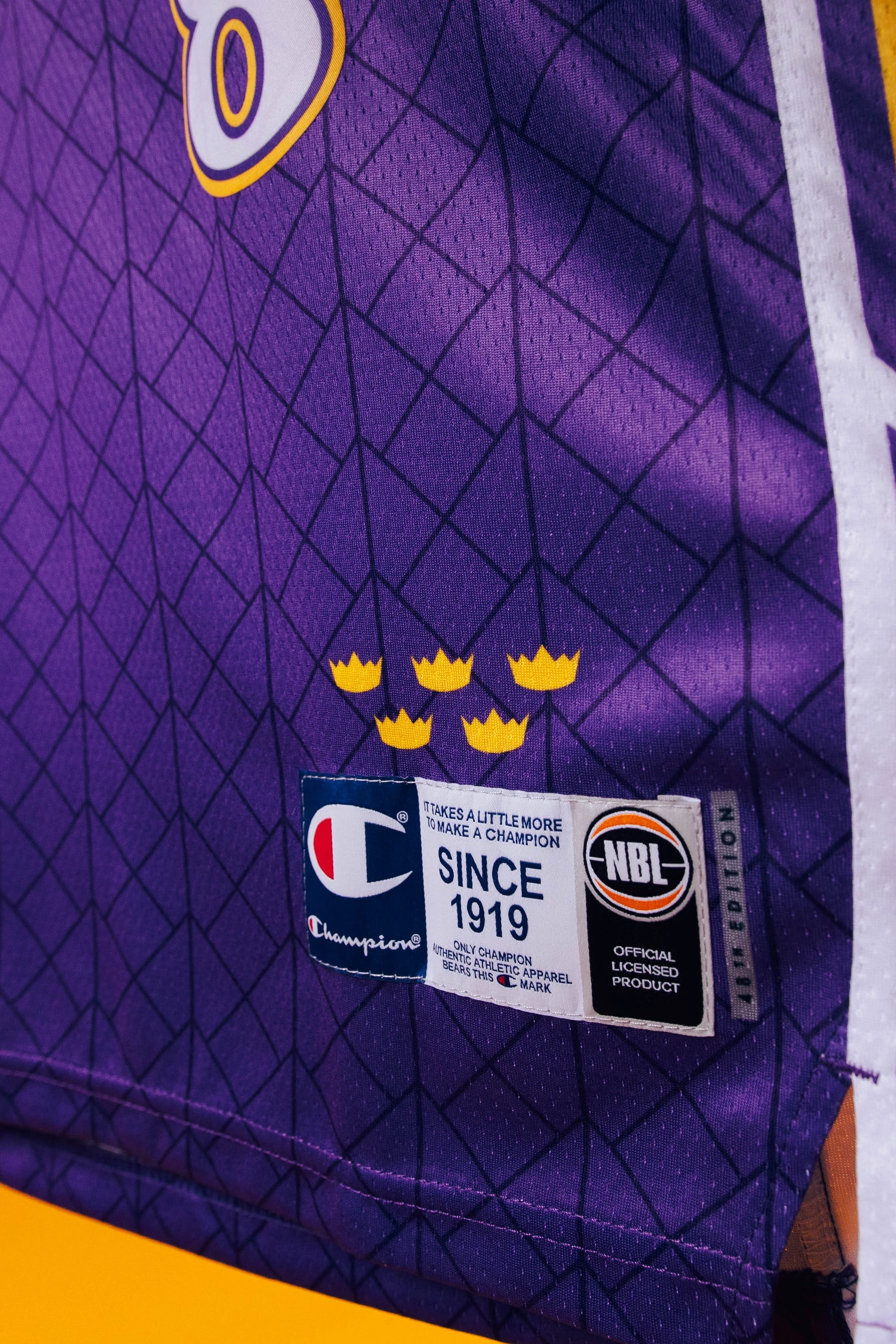
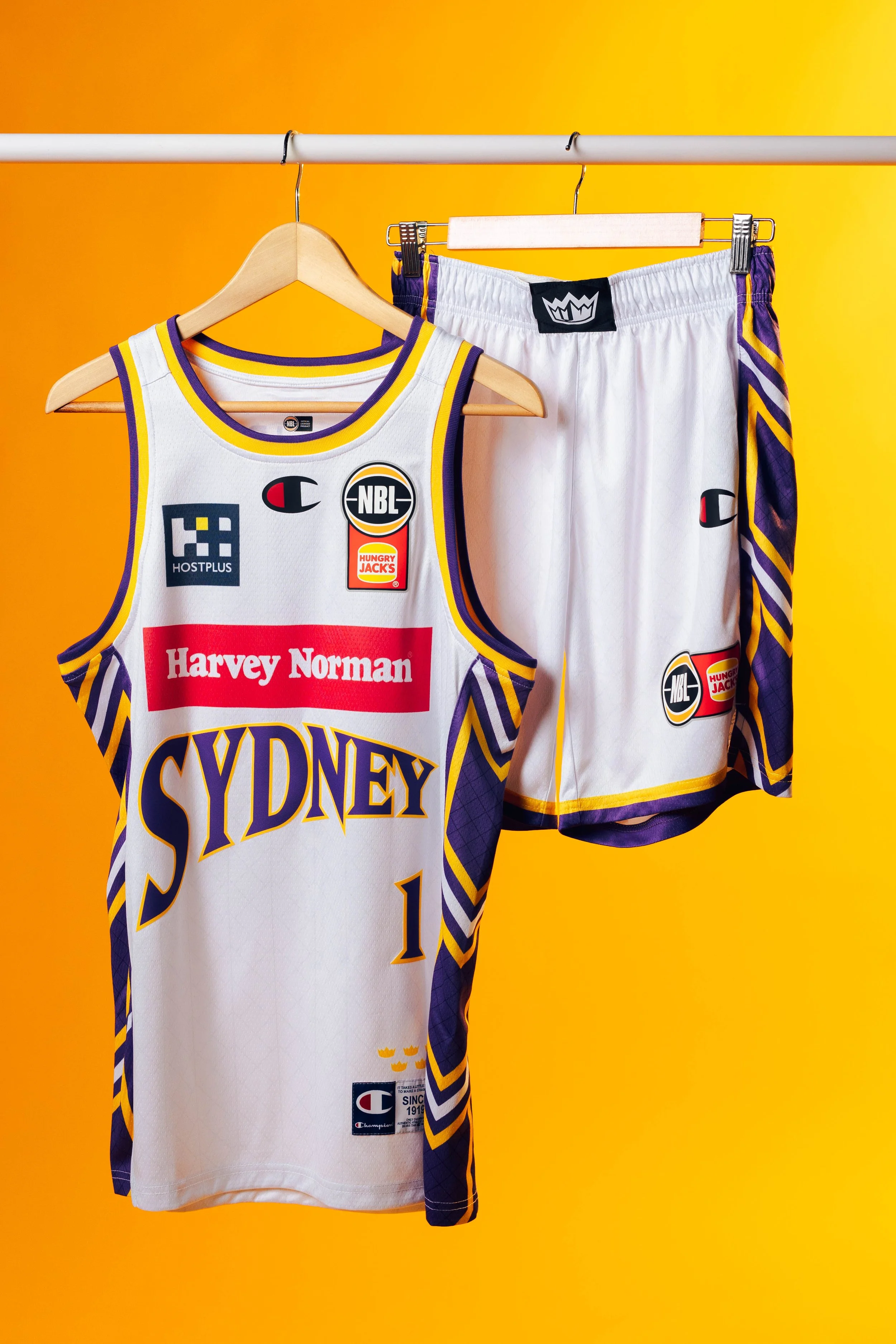
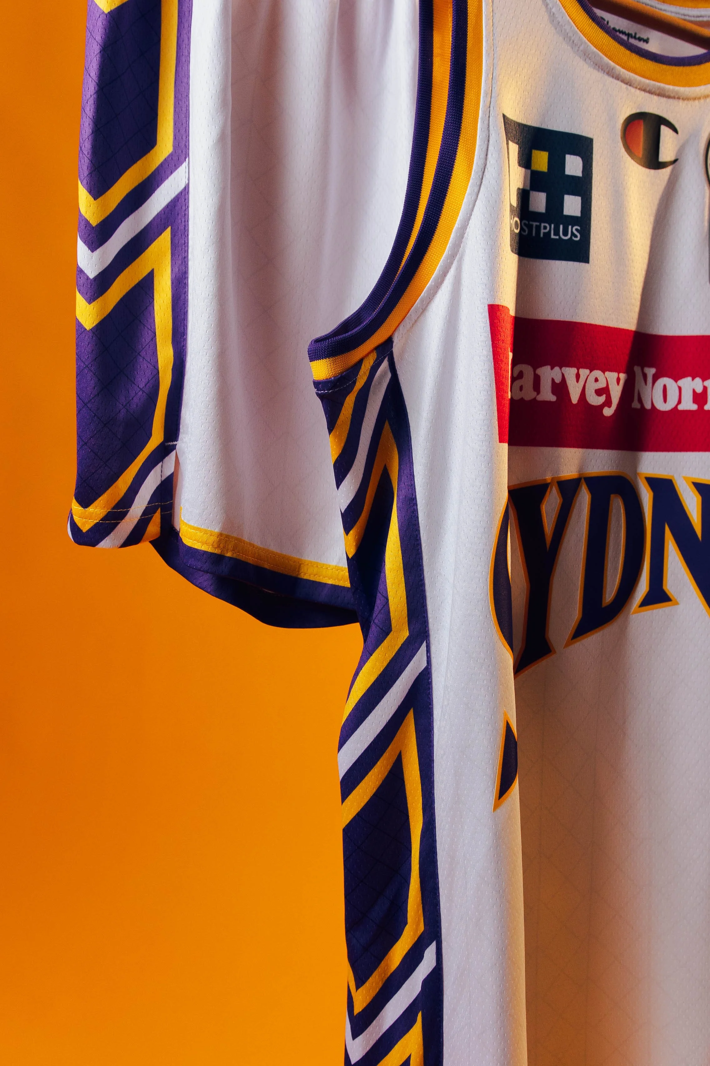
*Kings NBL26 Uniform Launch Shoot - Stills by Syd Nepomuceno. Uniform Design, Graphic Design and Shoot Creative Direction by me for Total Sport + Entertainment,
Season Rollout:
Creative Re-alignment
Role: Creative Direction / Graphic Design / Motion / Template Systems
As NBL26 began, a change in visual direction required the yellow-led social system to be substantially reworked while the season was already underway. The change primarily affected ongoing social content, while approved touchpoints including uniforms, merchandise, sponsorship, membership, signage and game-day motion graphics remained in place.
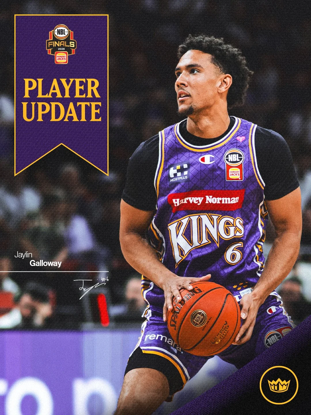
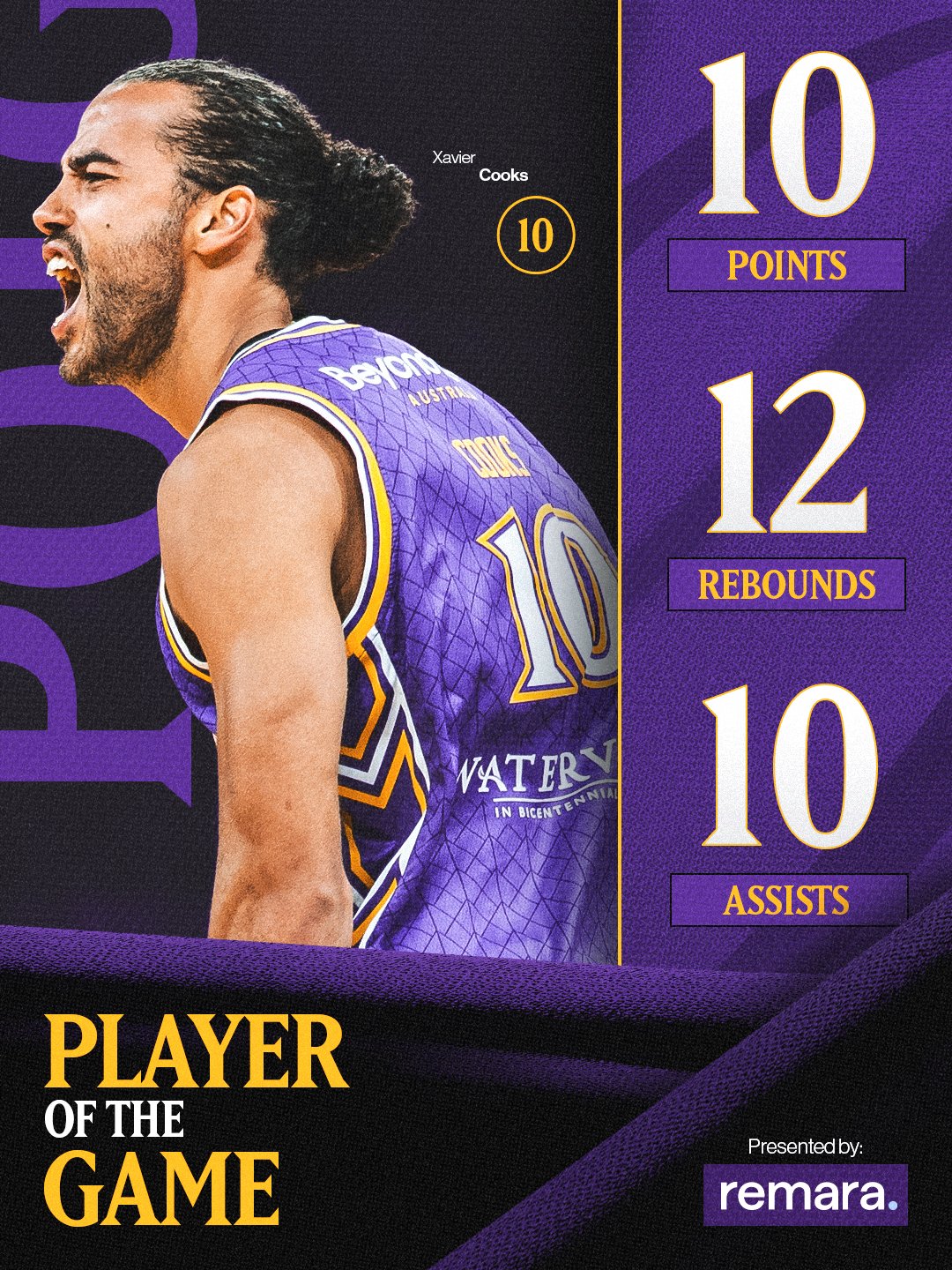
I led the rapid re-alignment, restructuring the social system into 2 complementary modes aligned with the club’s uniforms. Home games adopted a dark, purple-led treatment, while Light Mode gave away games a brighter identity and provided audiences with an immediate visual distinction between fixtures.
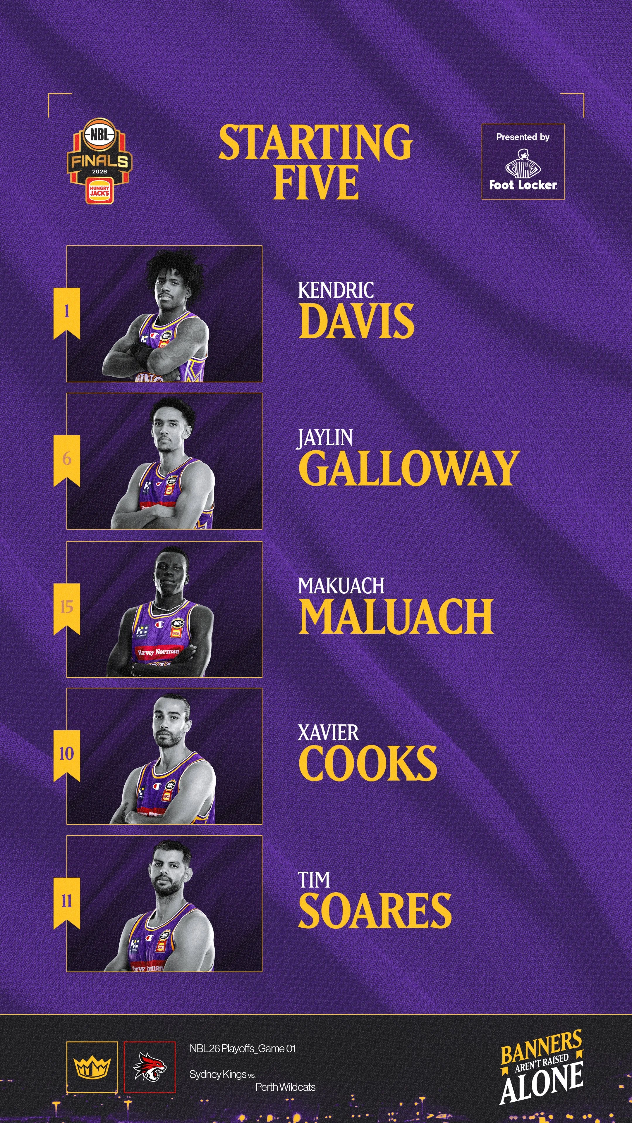
Light Mode extended the established Kings identity rather than introducing a separate look, broadening the brand’s tonal range without relying on darkness or intensity in every execution. I translated both modes into 2 corresponding social template suites, enabling the Kings’ internal team to update and deploy content for every game.
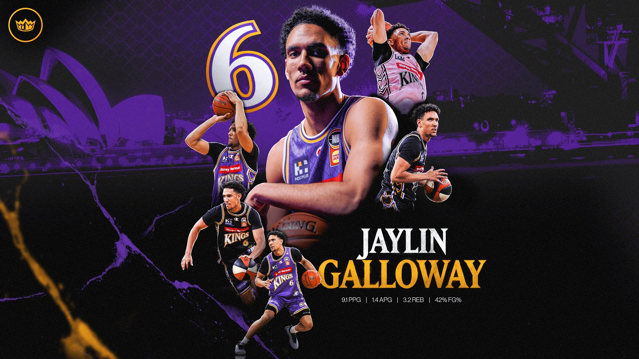
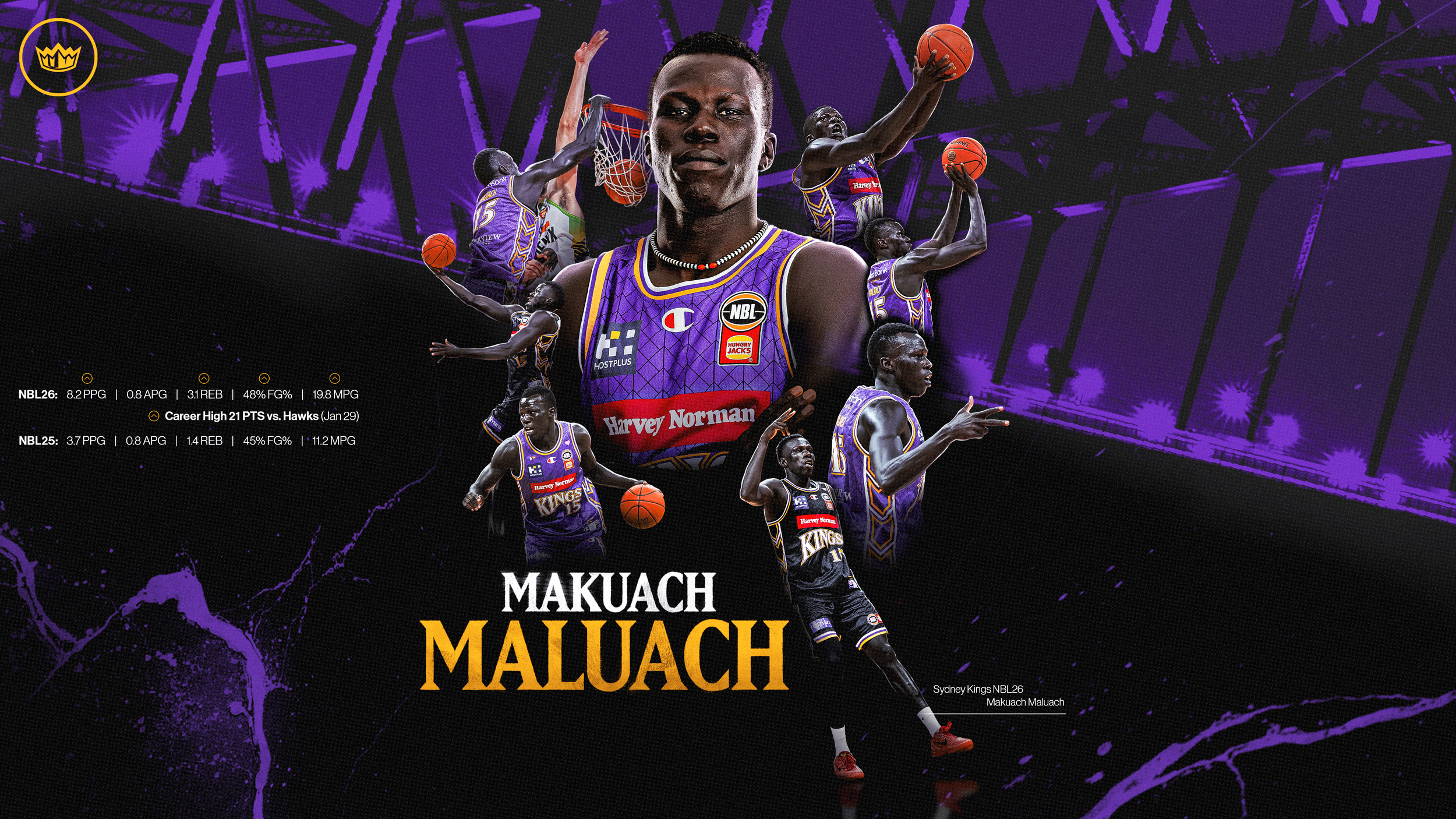
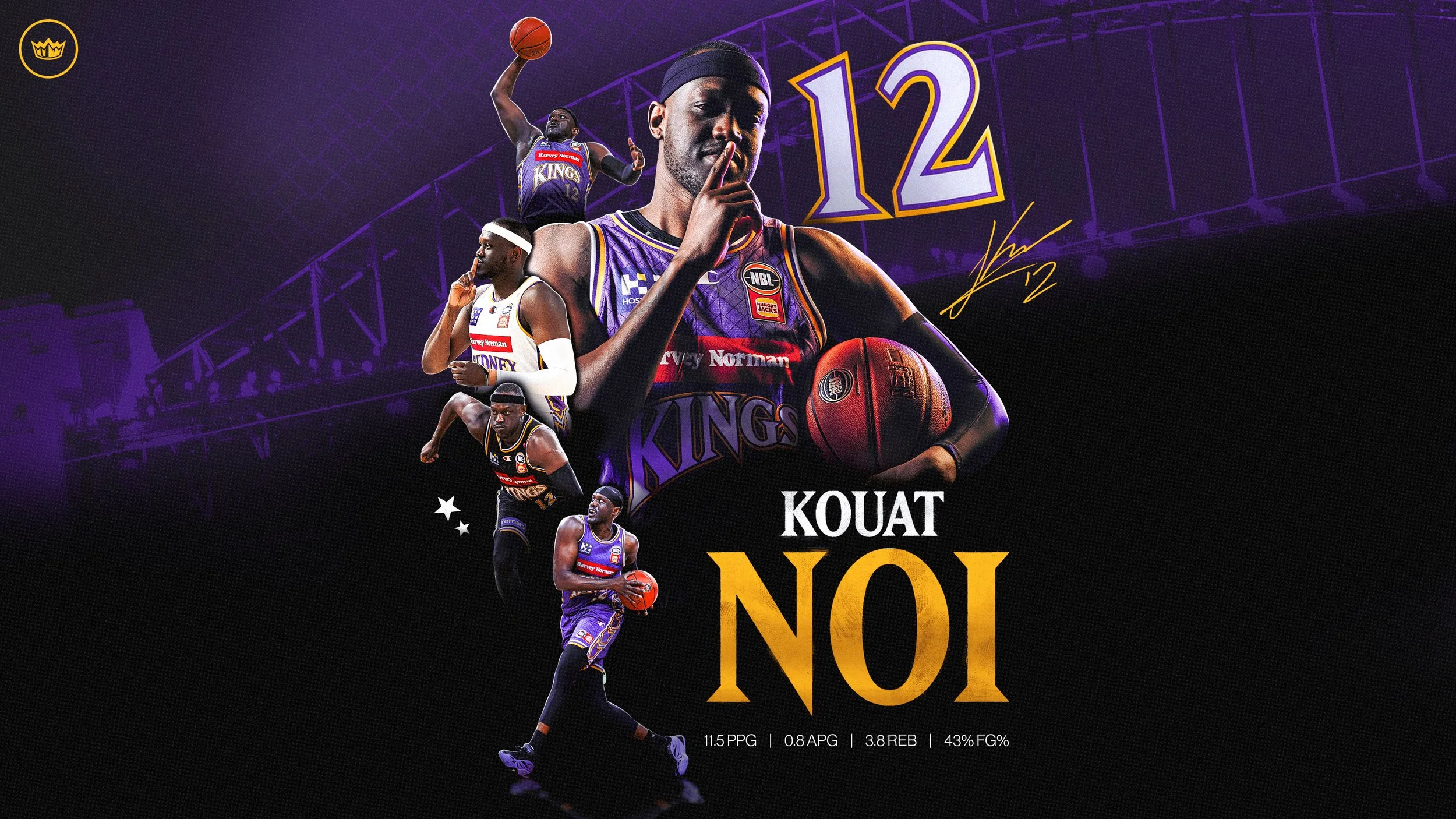

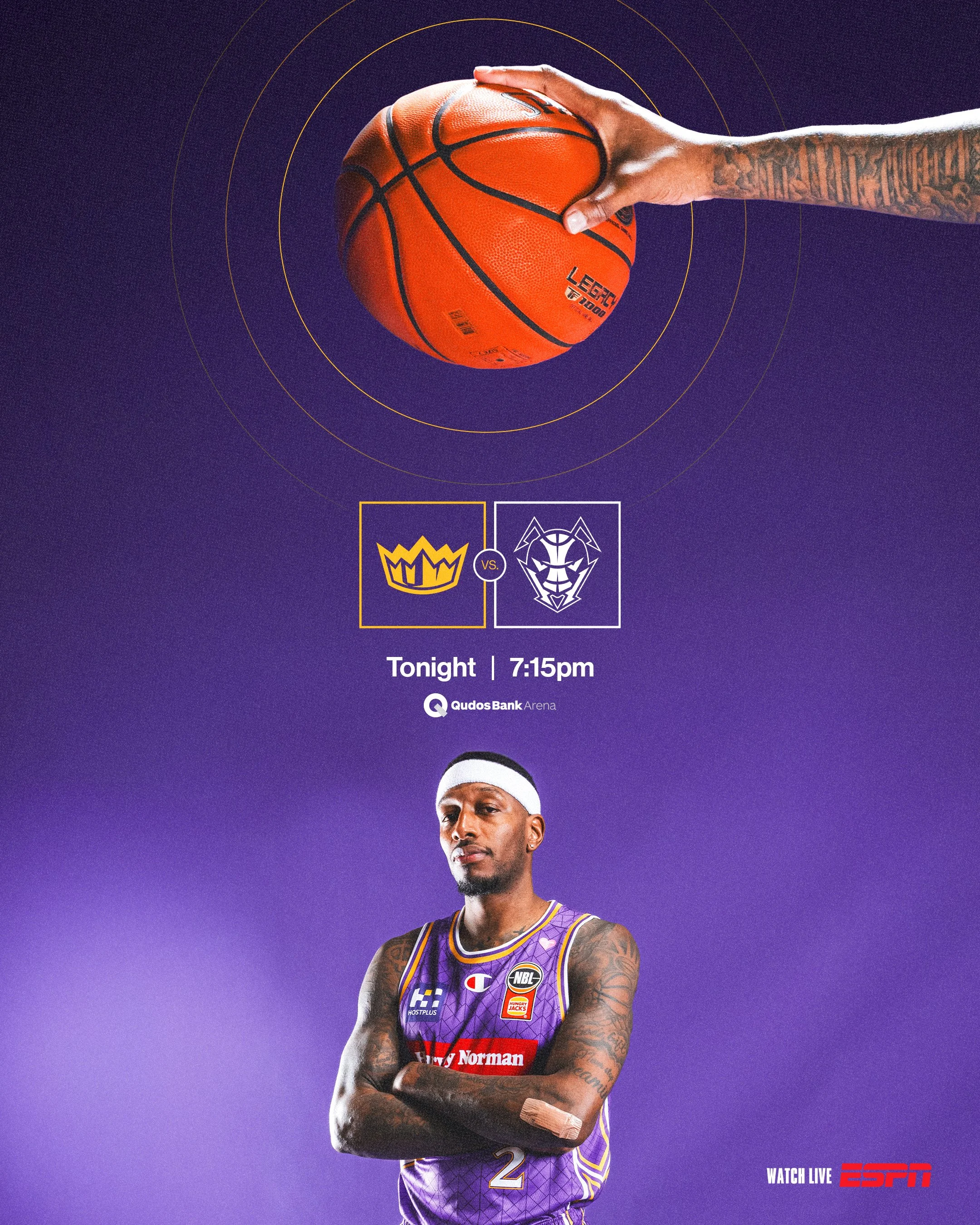
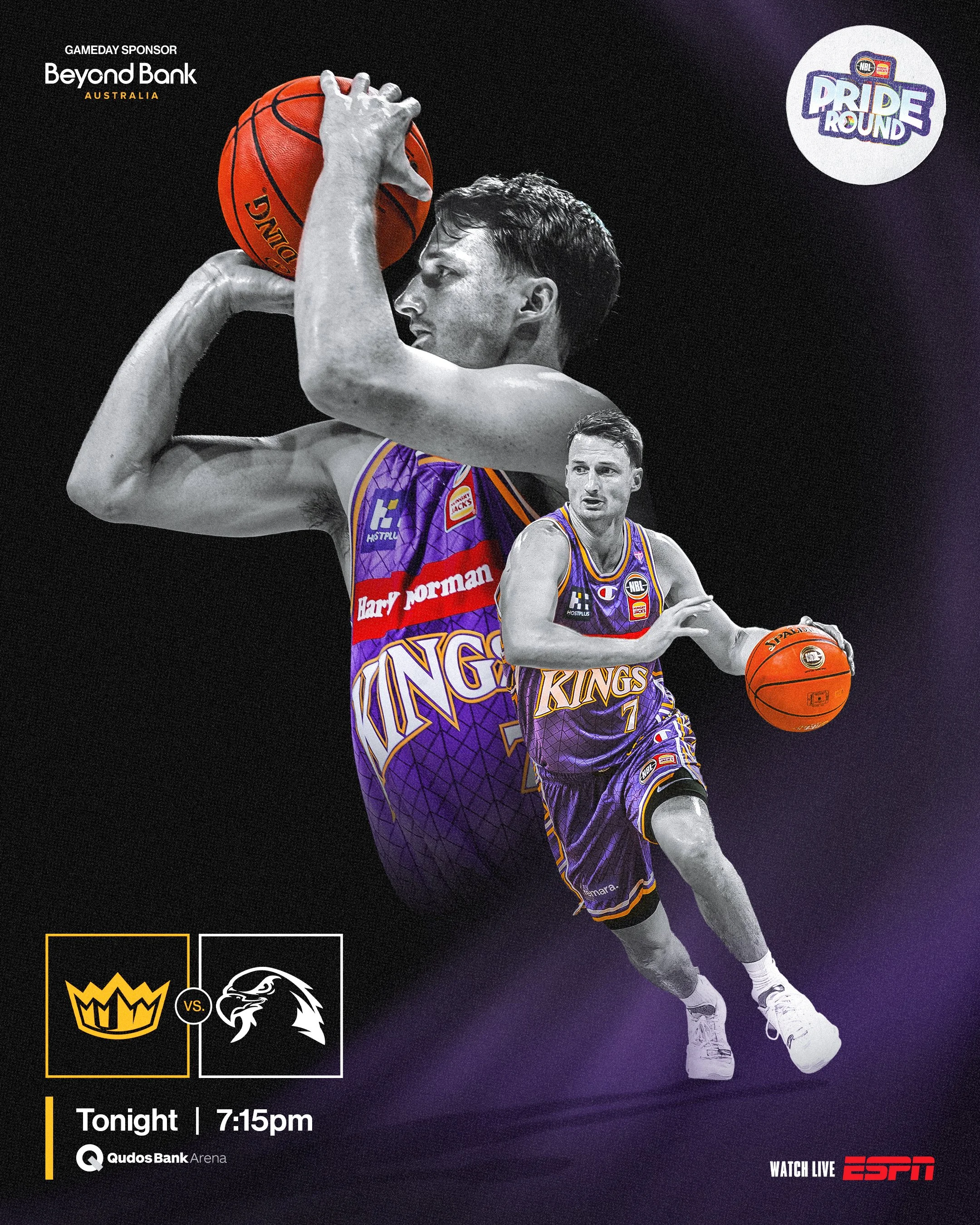
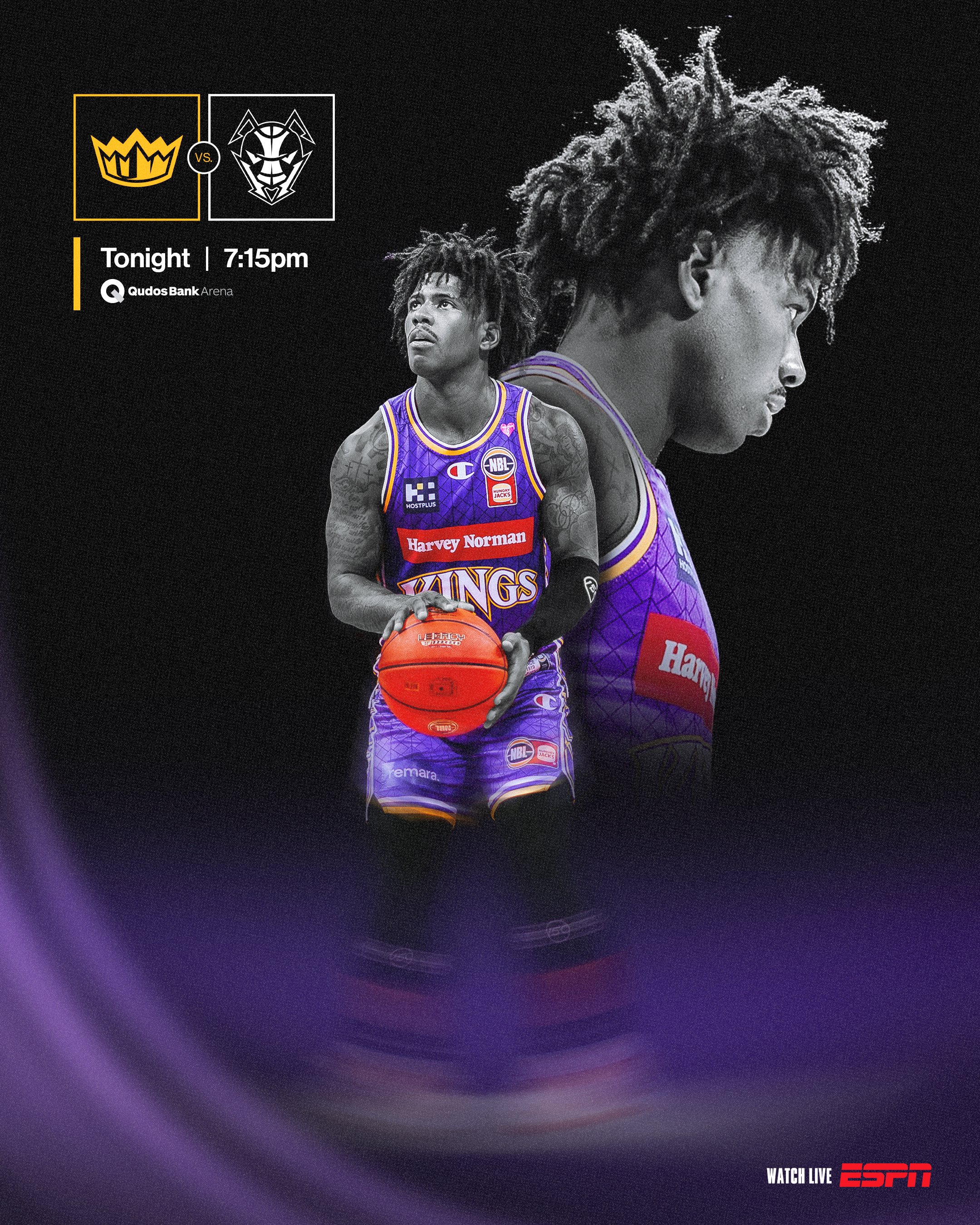
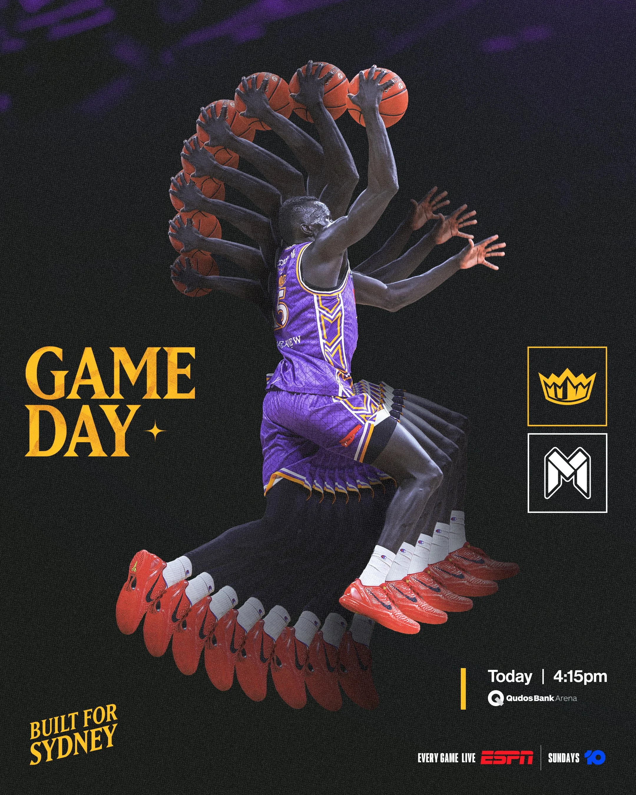

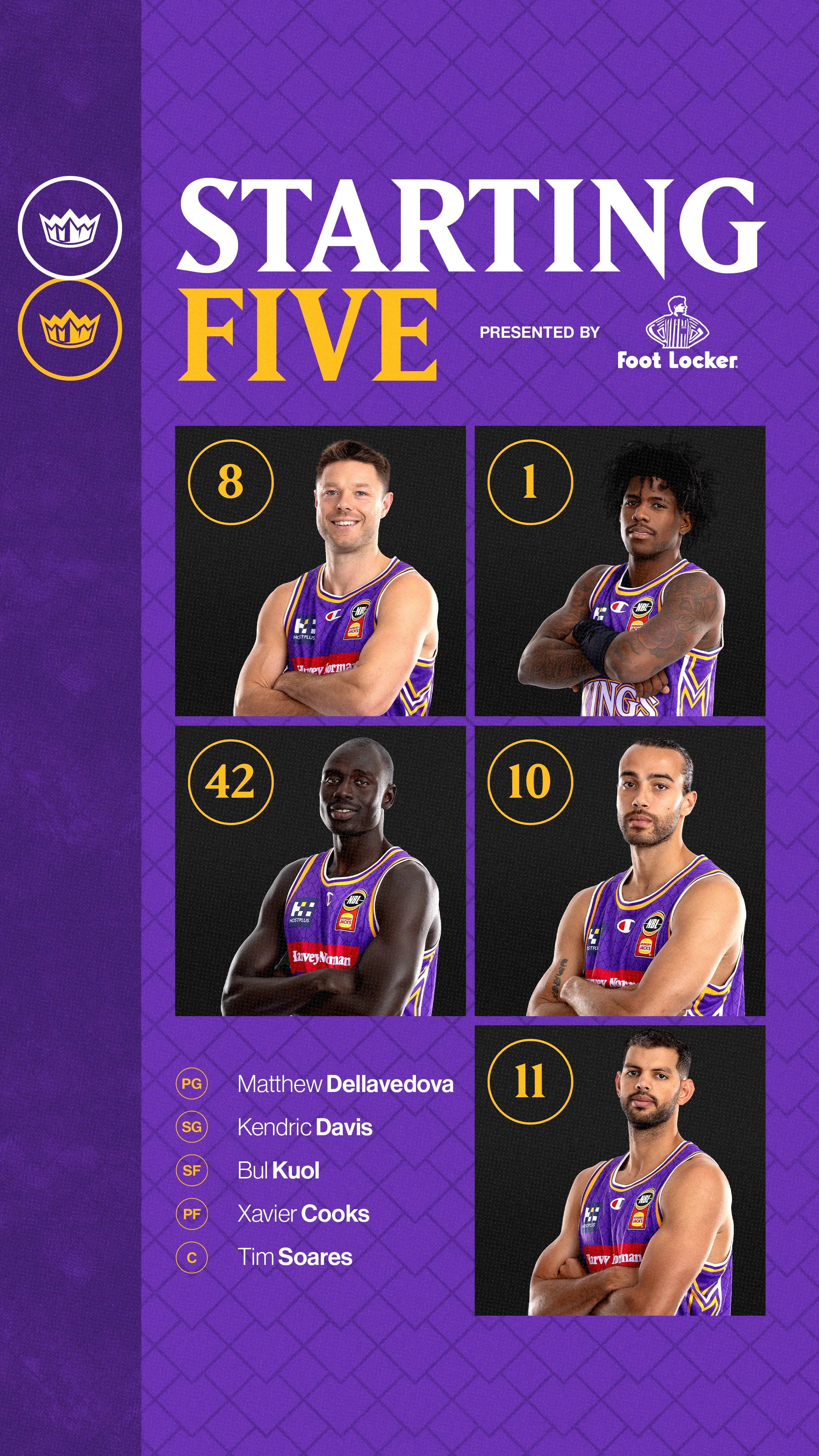
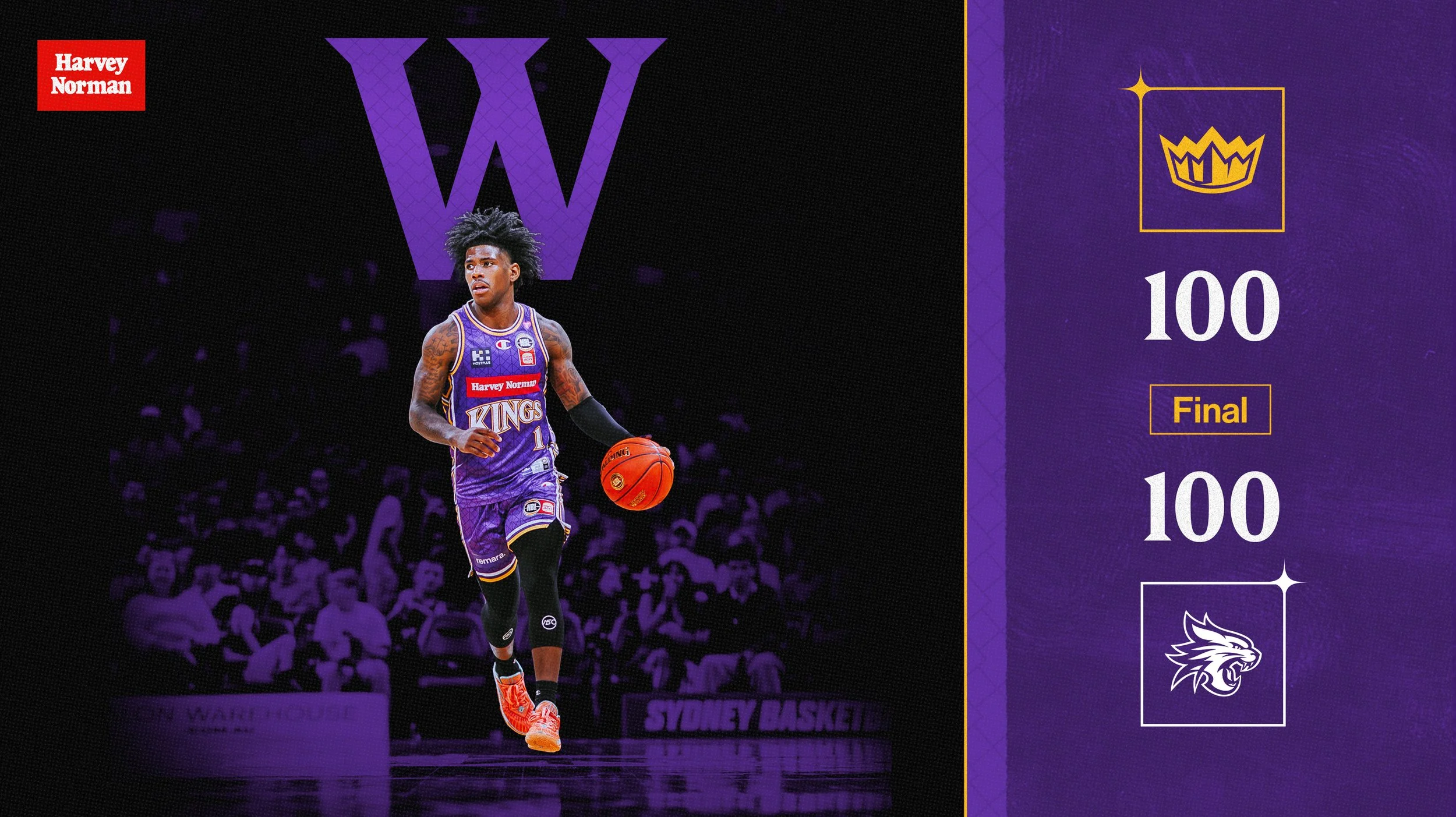



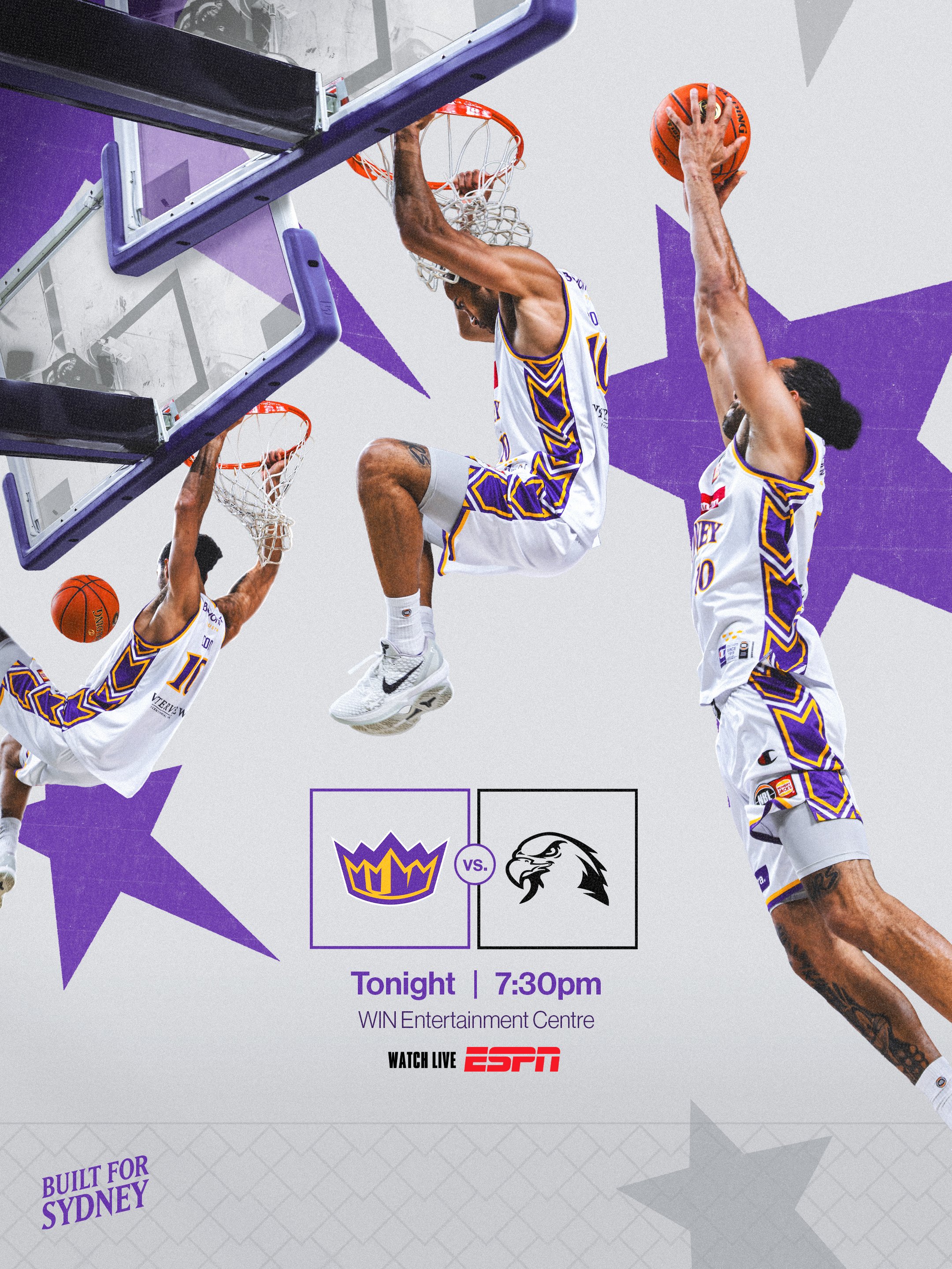


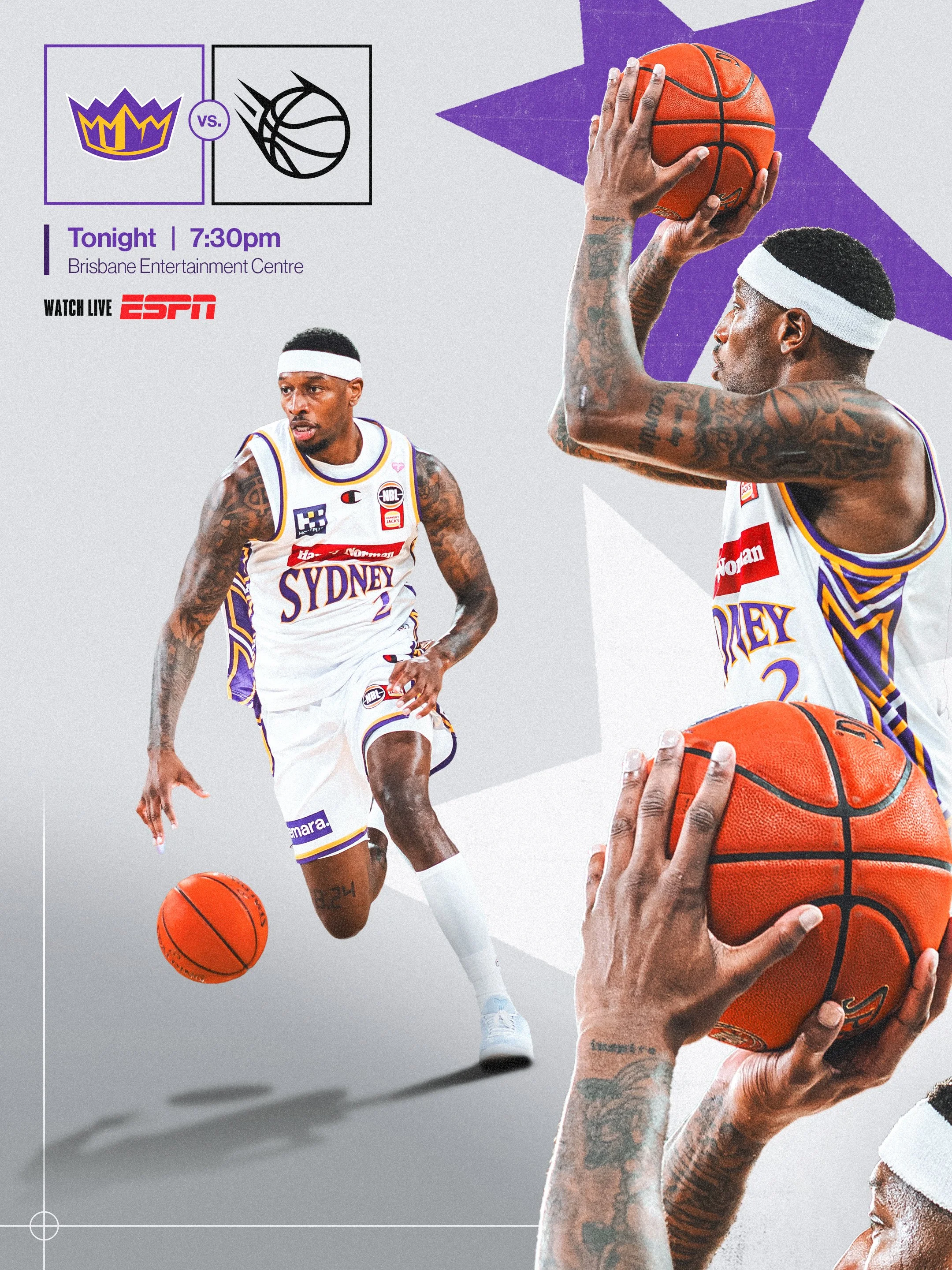

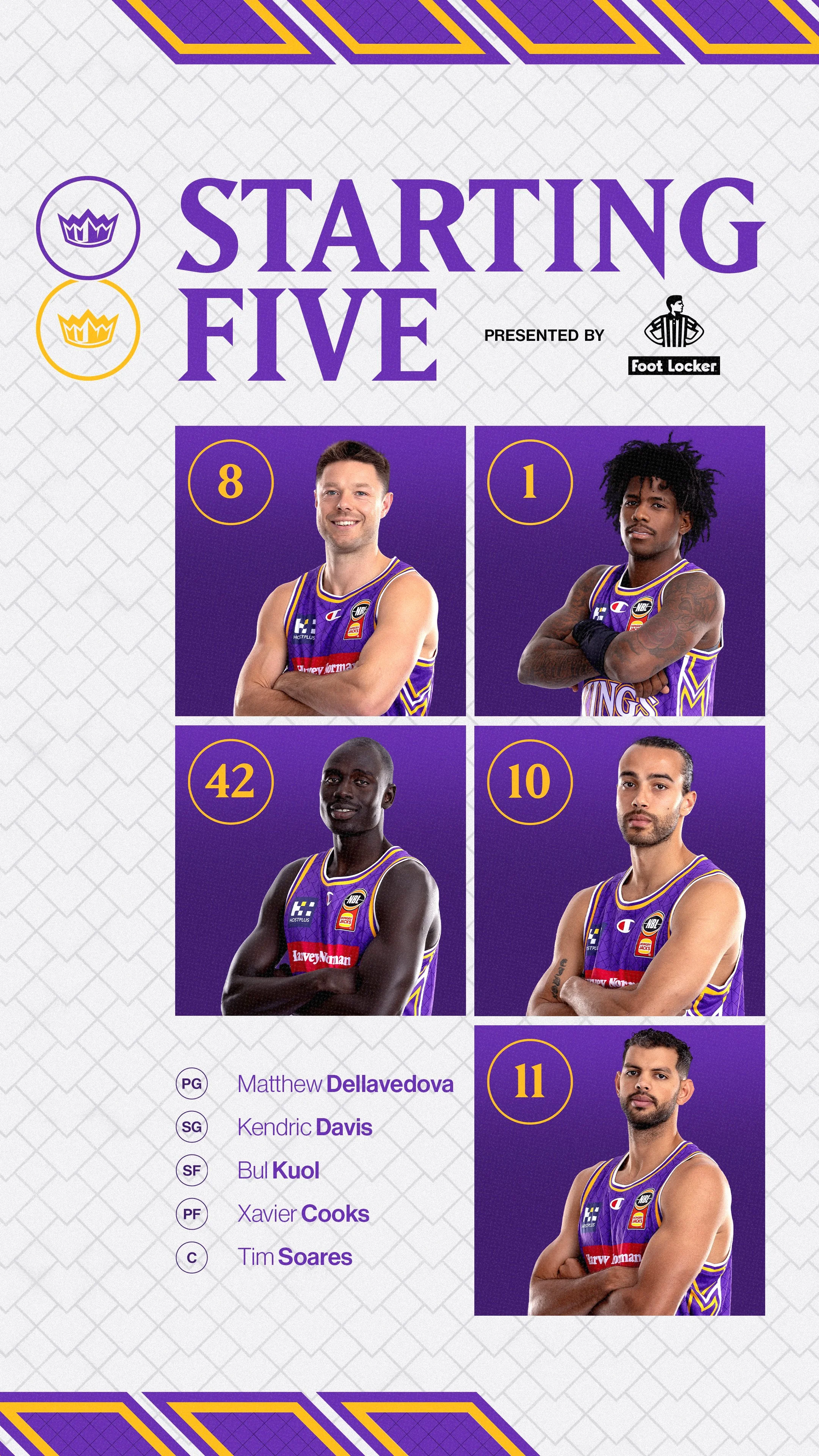
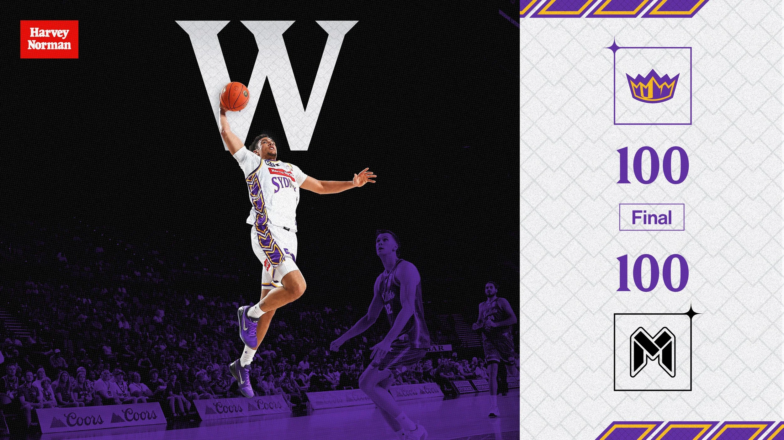

*Regular Season Socials - Graphic Design by me for Total Sport + Entertainment,
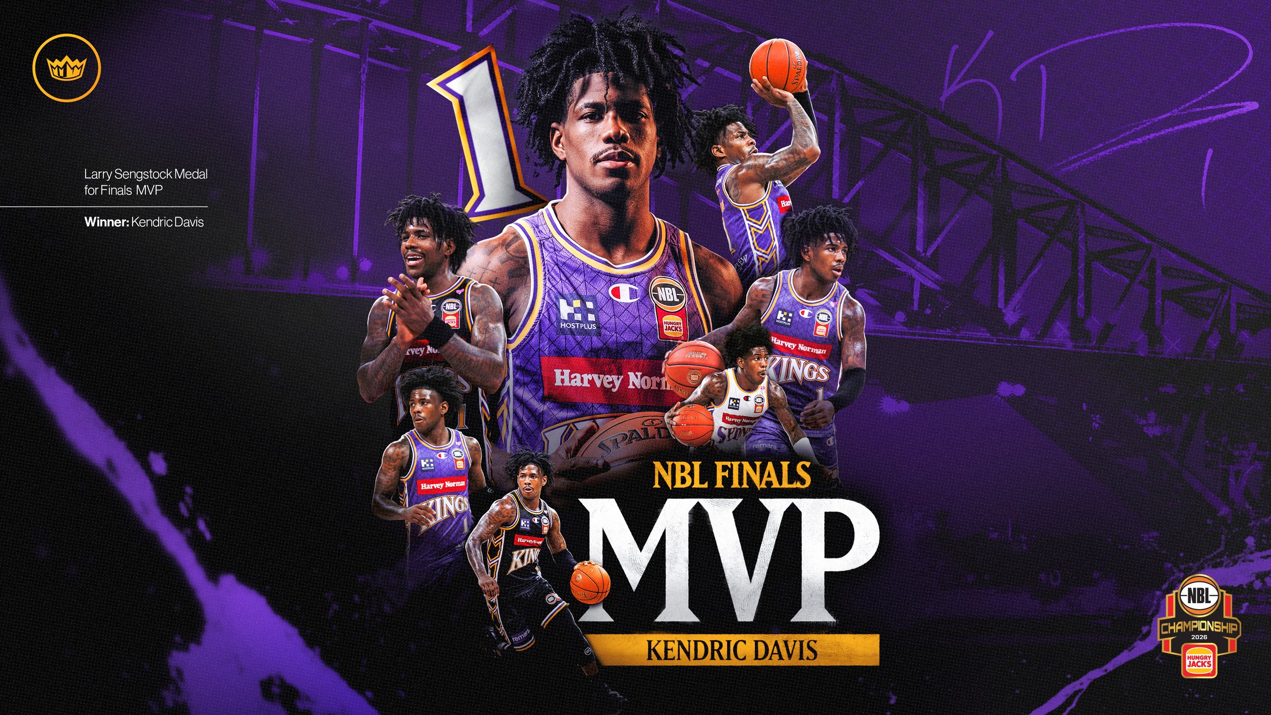
Finals Campaign
‘Banners Aren’t Raised Alone’
Position: Creative Lead
Role: Creative Direction / Art Direction / Graphic Design / Motion / Merchandise / Template Systems / OOH
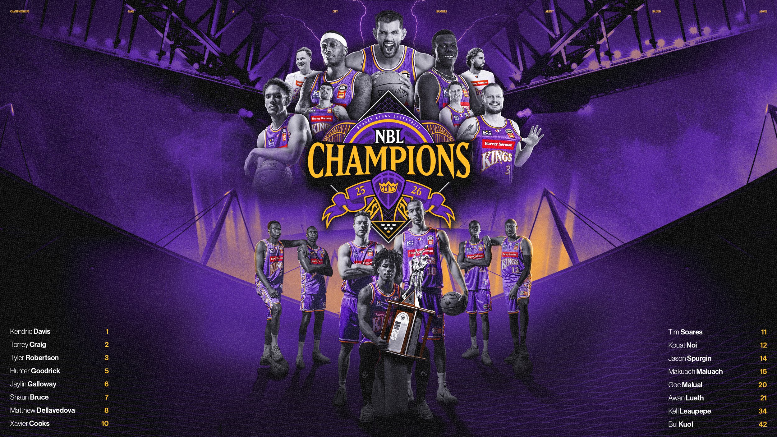
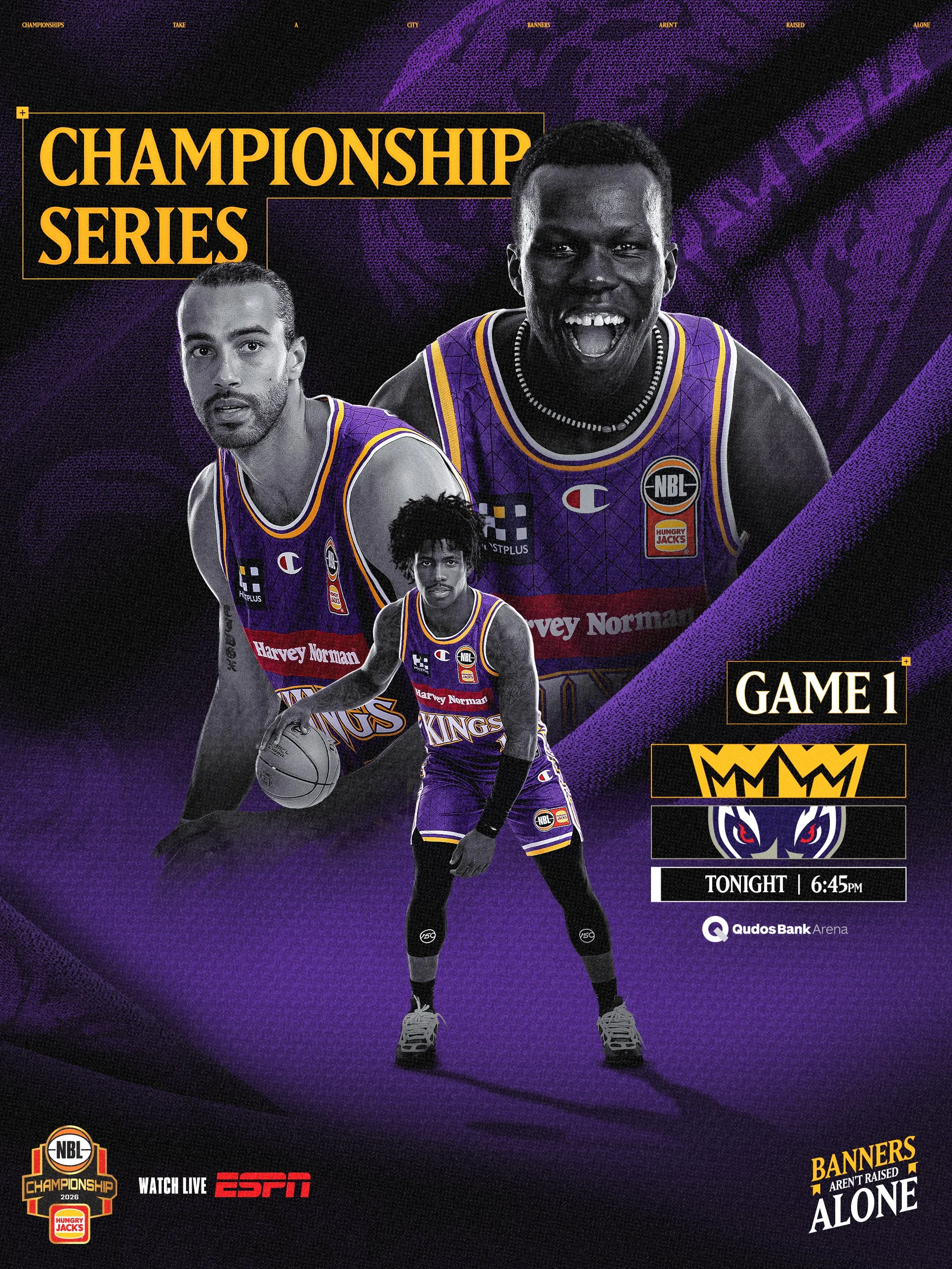
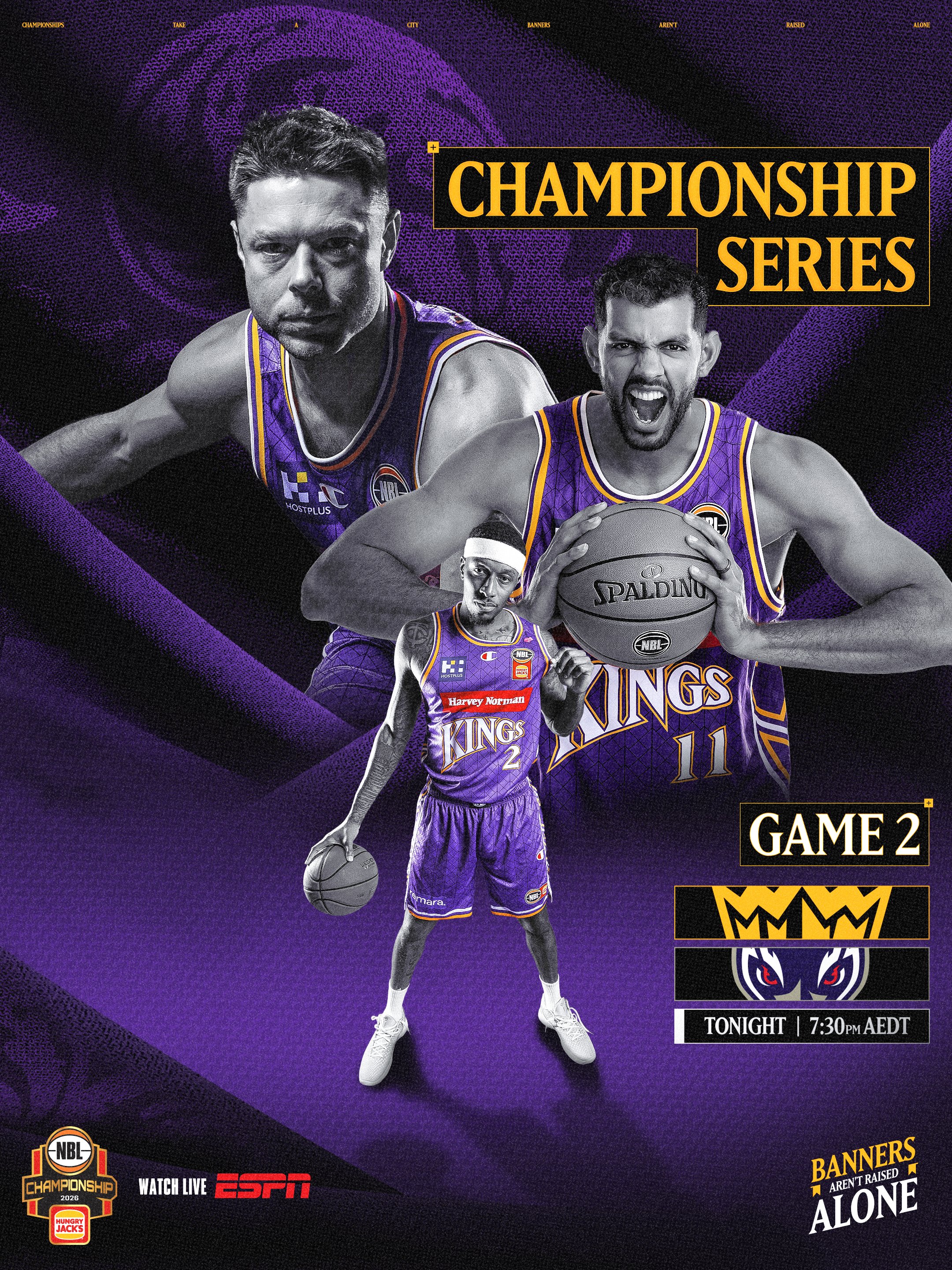
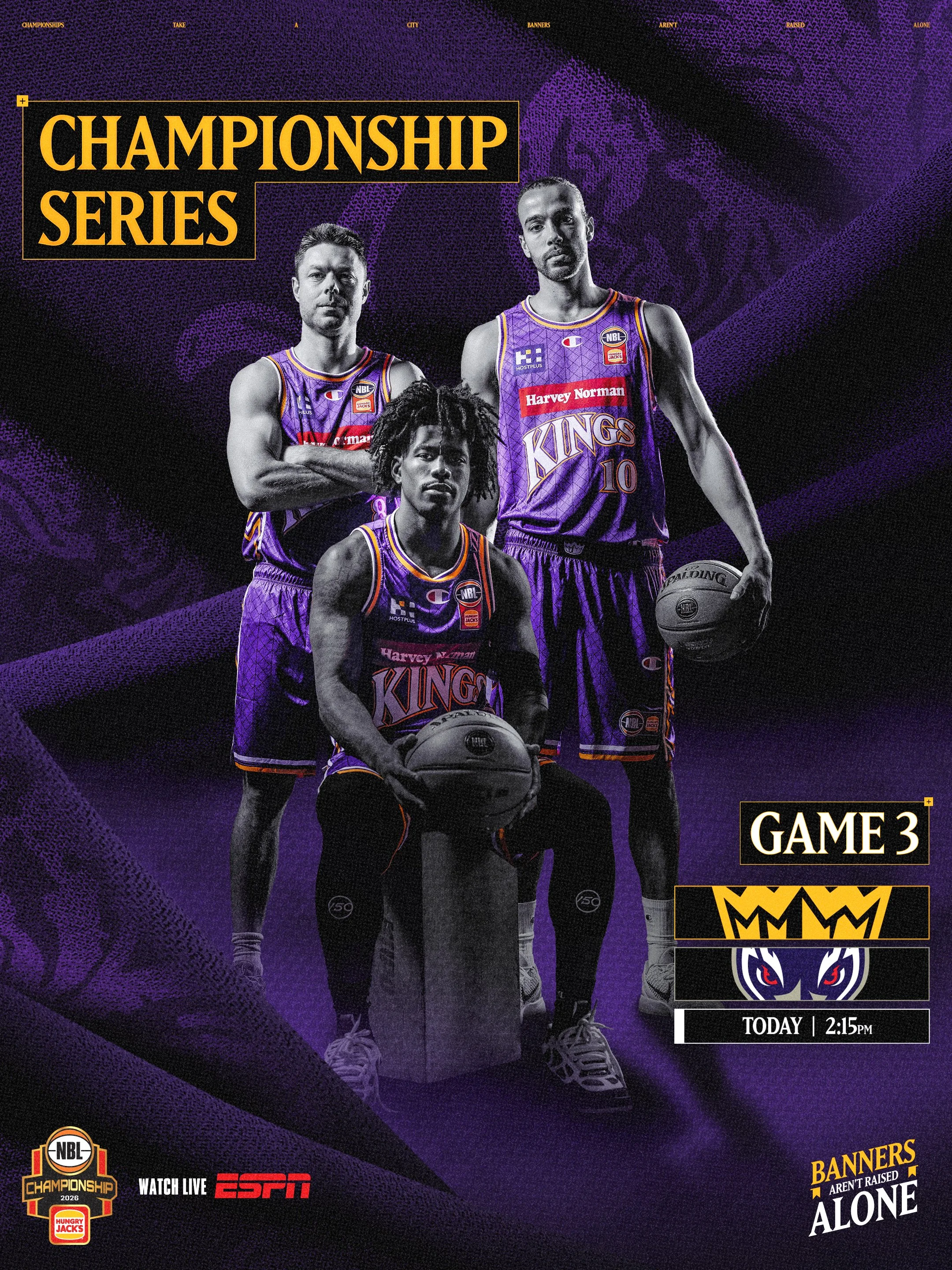
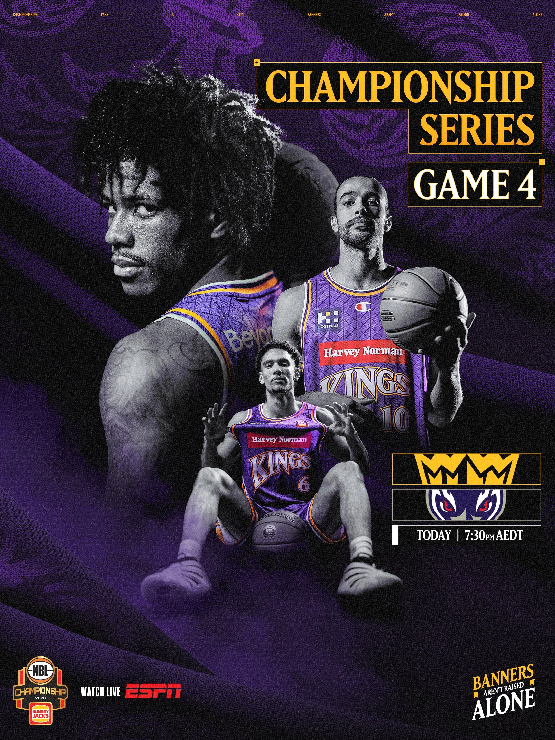
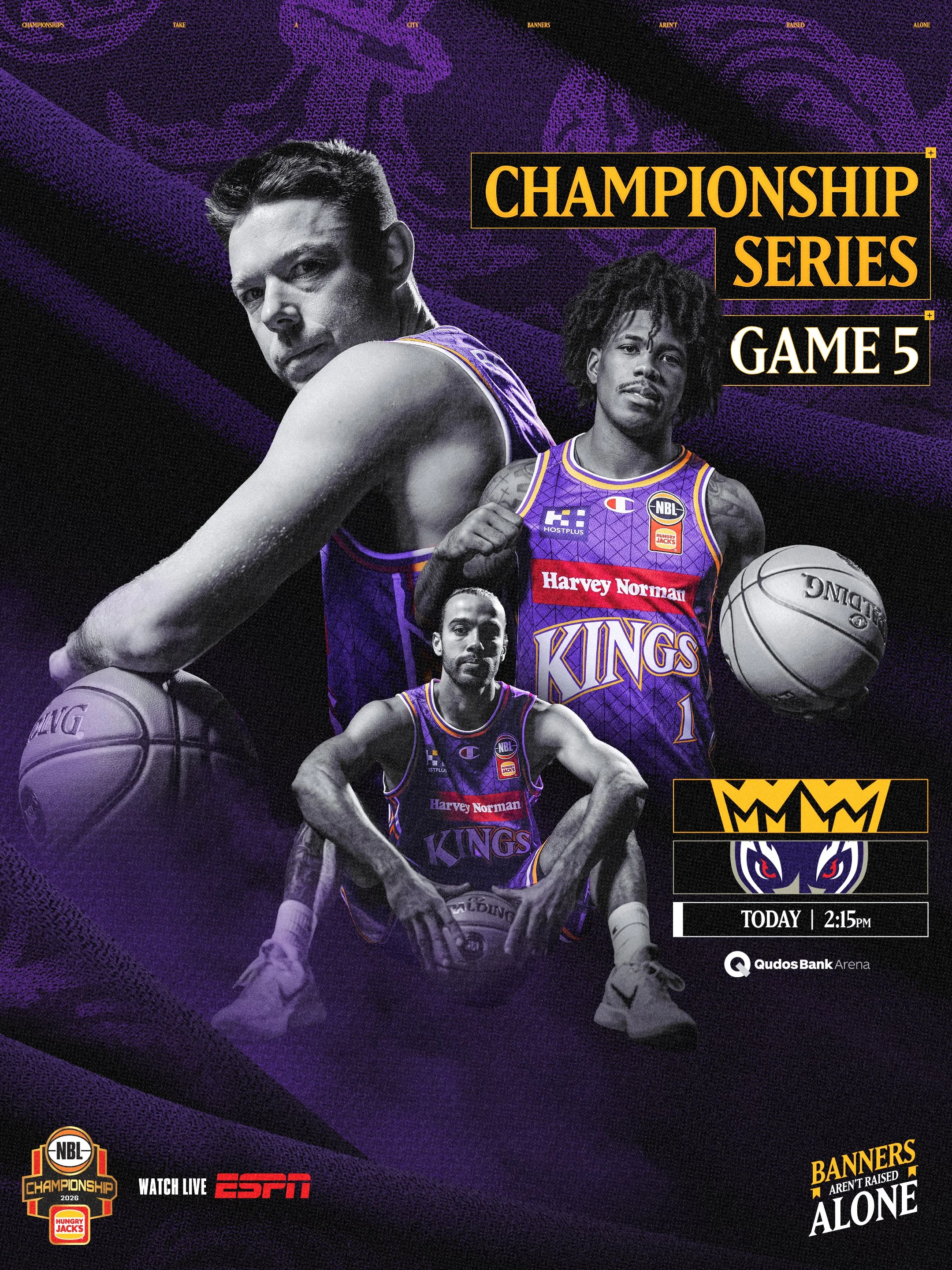
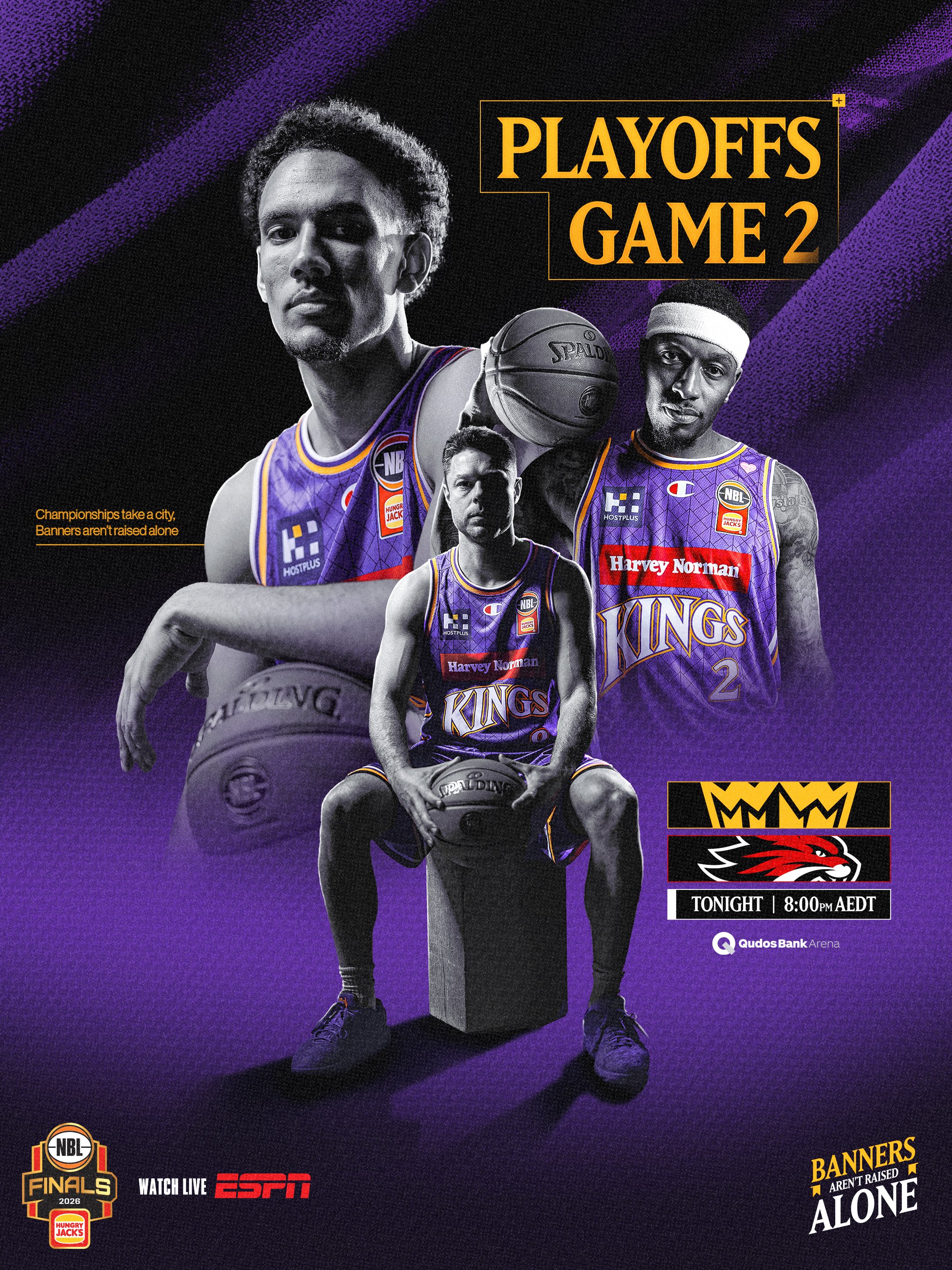
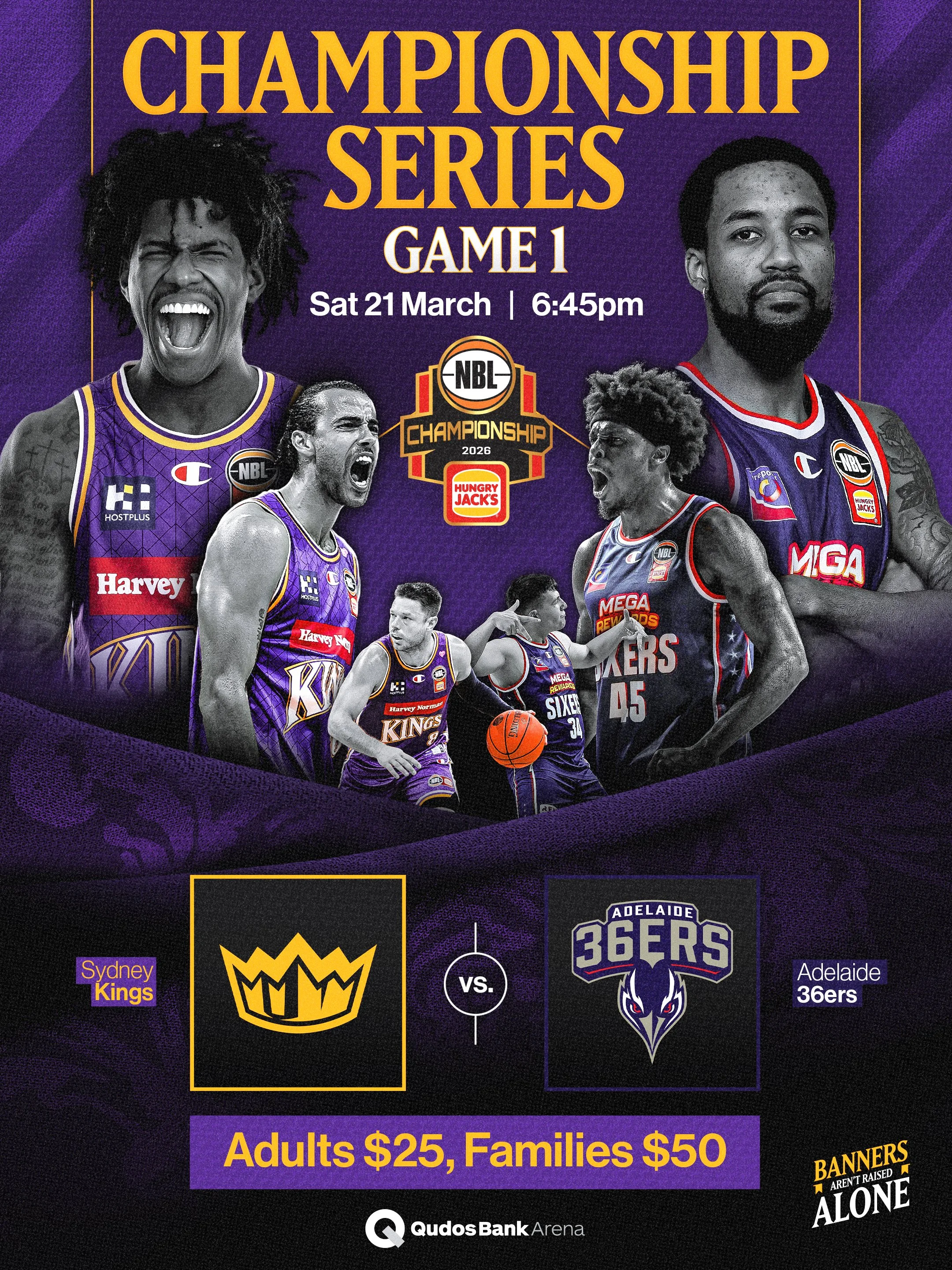
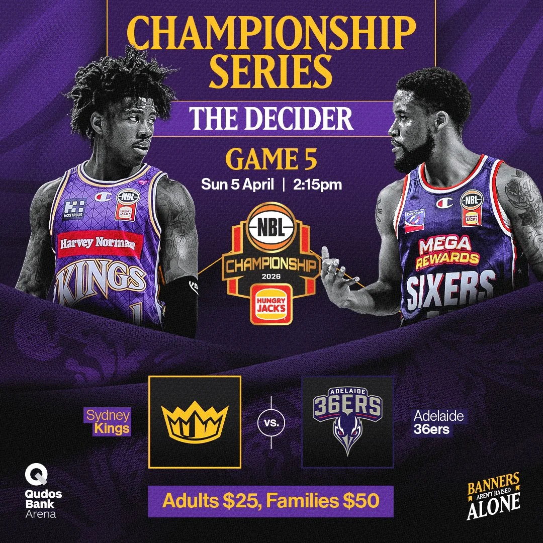
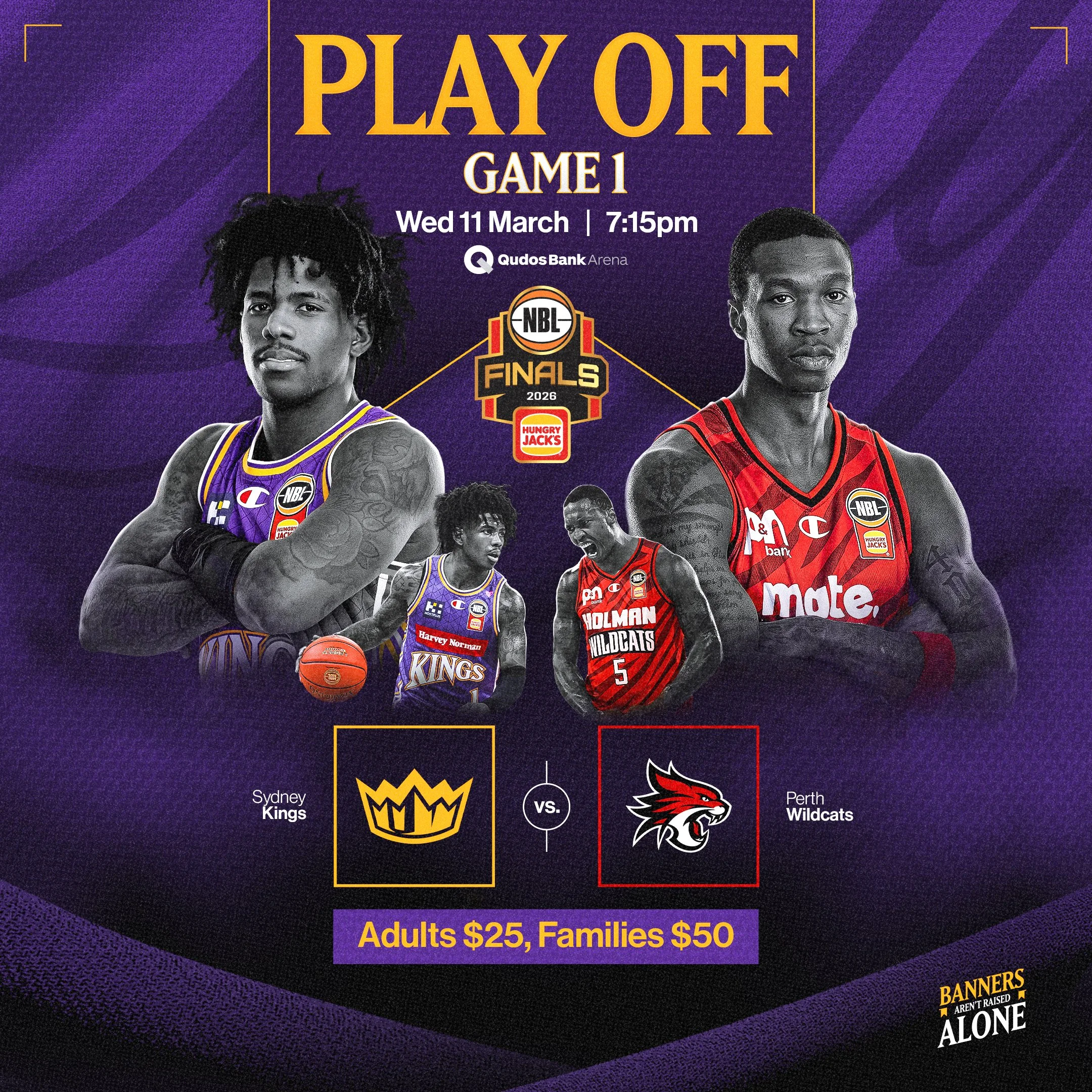
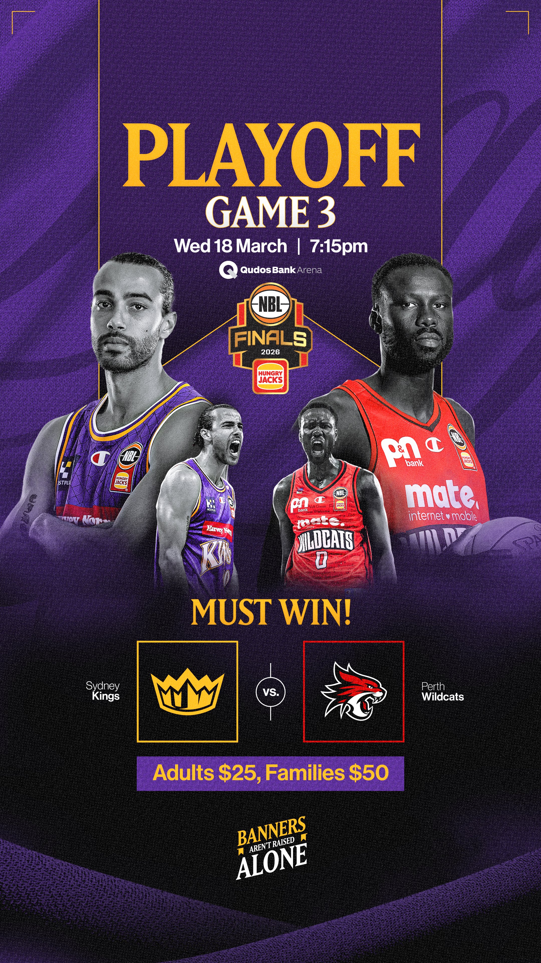
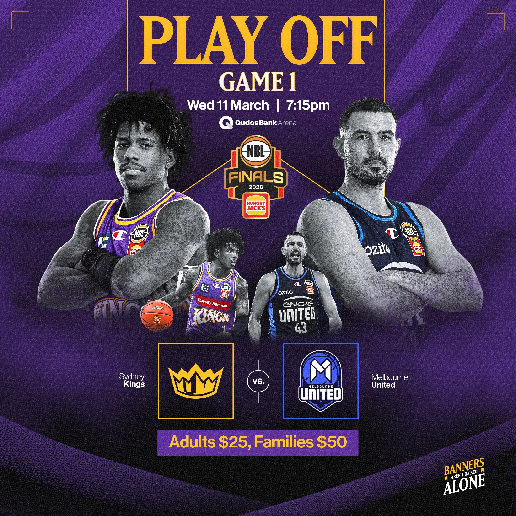
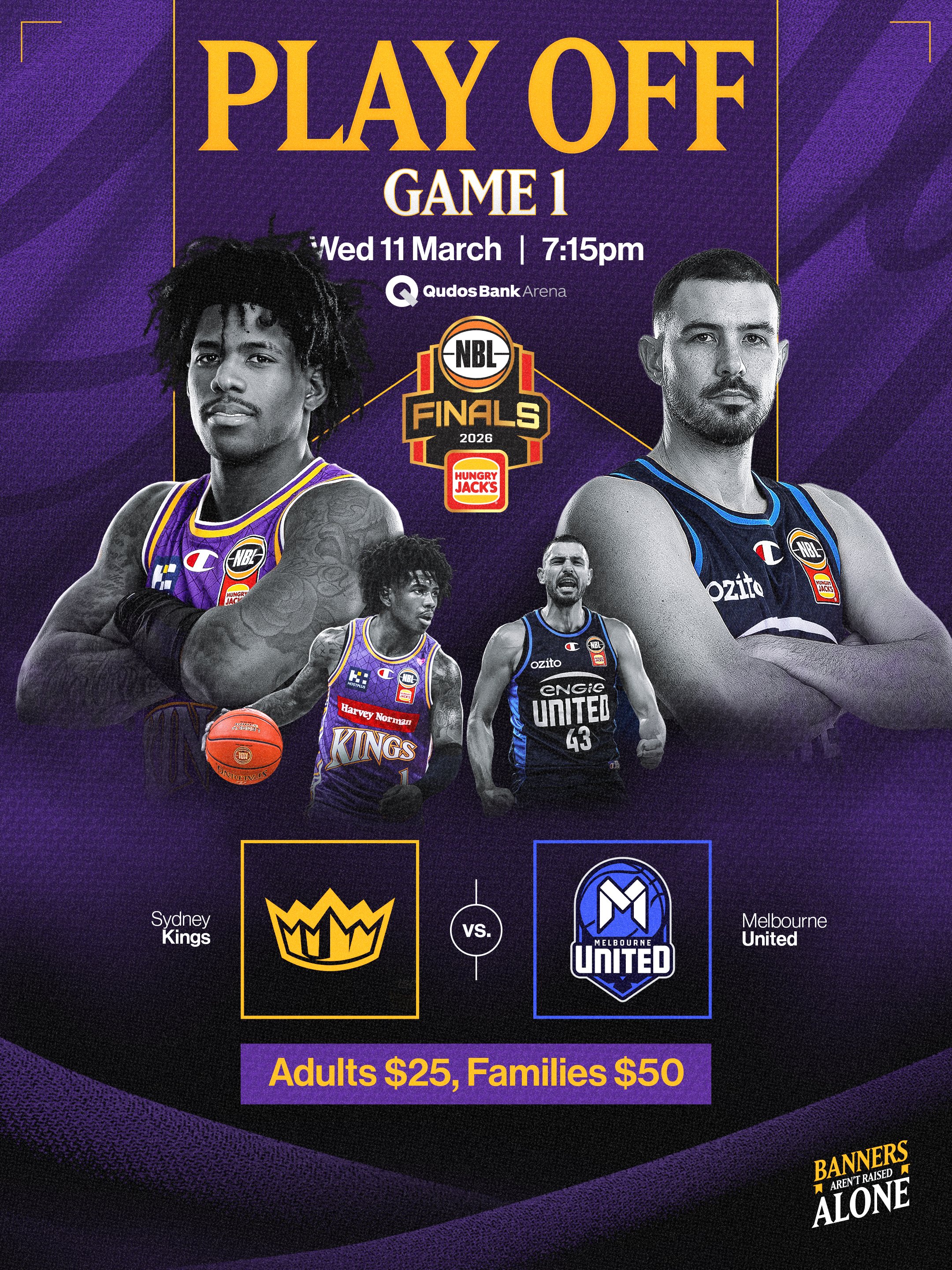
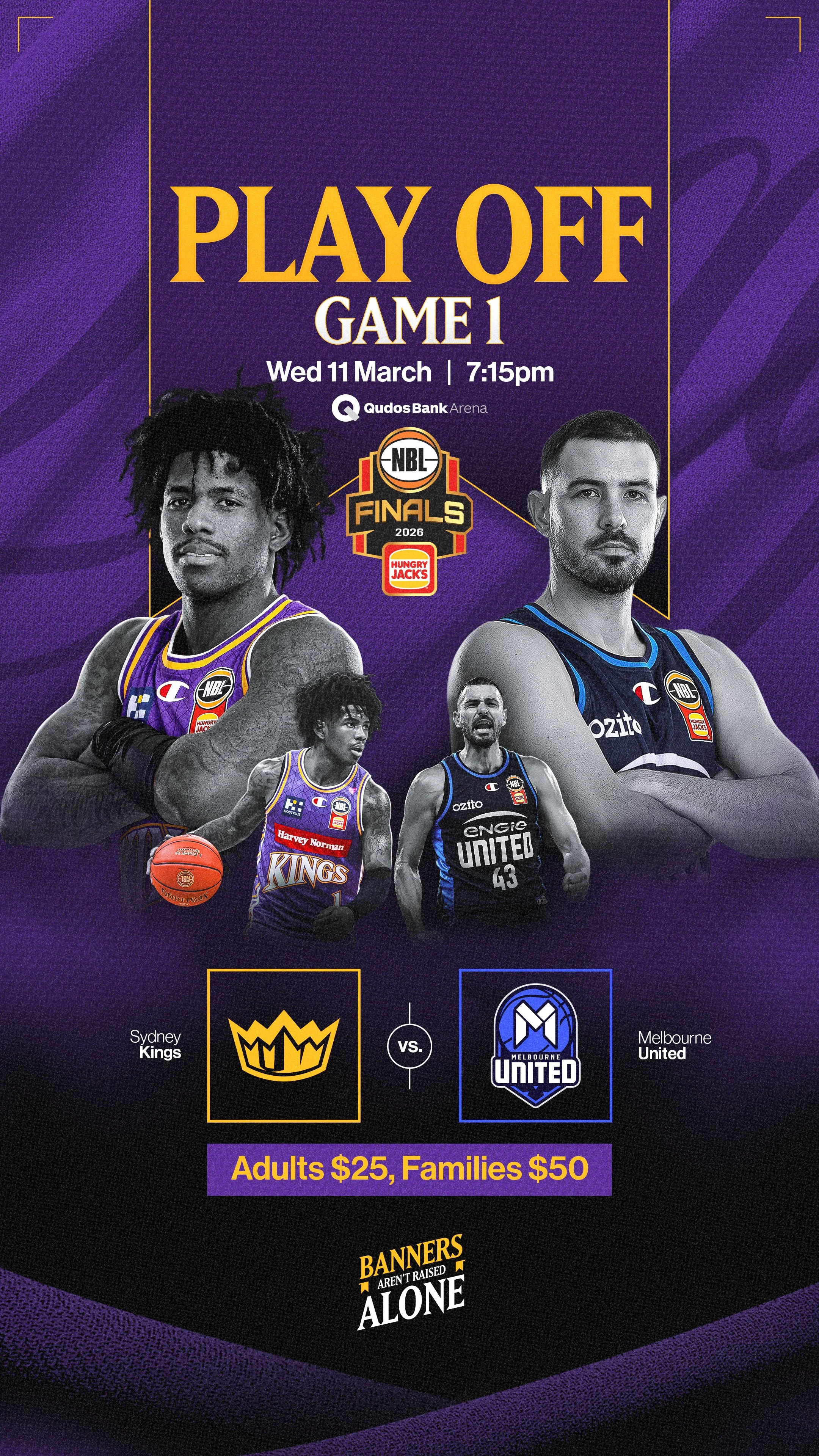
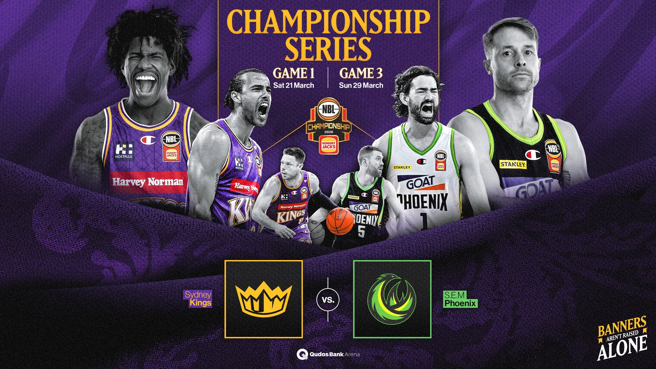
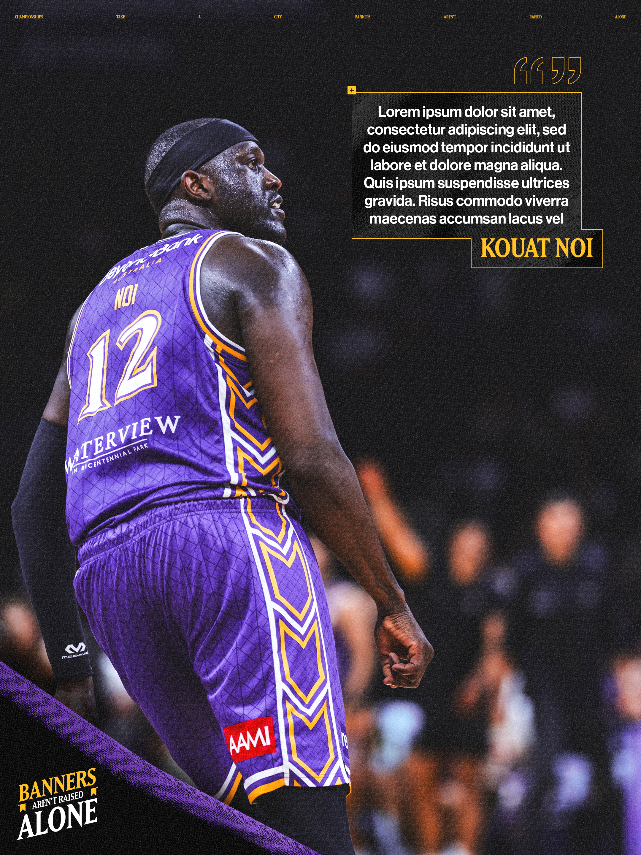
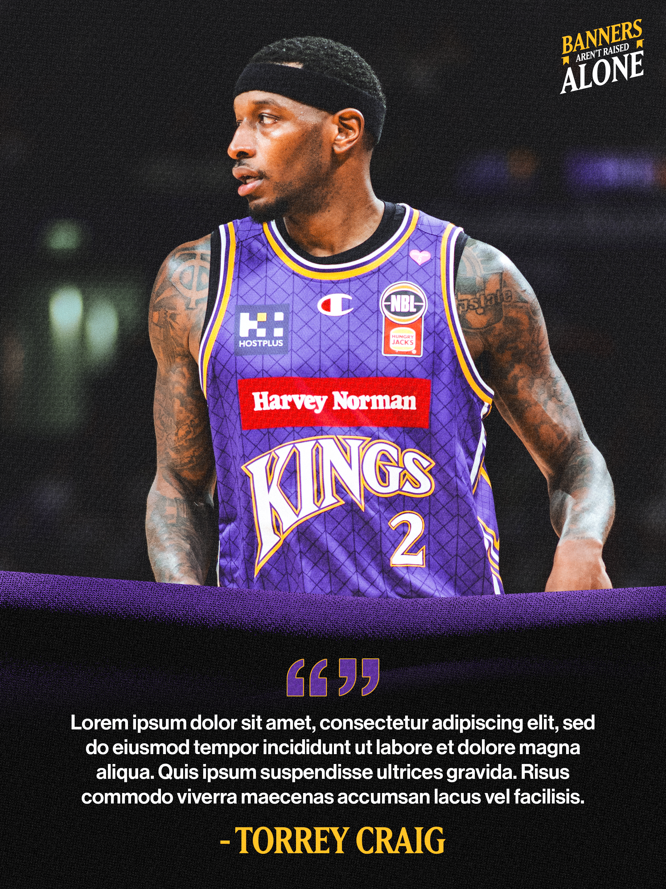
For the NBL26 Finals, I was briefed to develop a creative direction centred on the Kings’ pursuit of their 6th championship banner. In consultation with internal Kings stakeholders, we developed ‘Banners Aren’t Raised Alone’, connecting that goal with the collective contribution of the players, club, city and supporters.
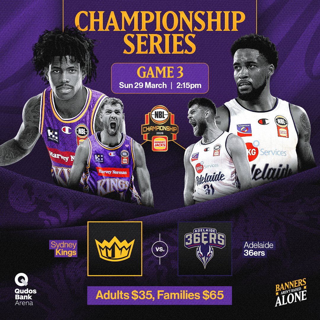
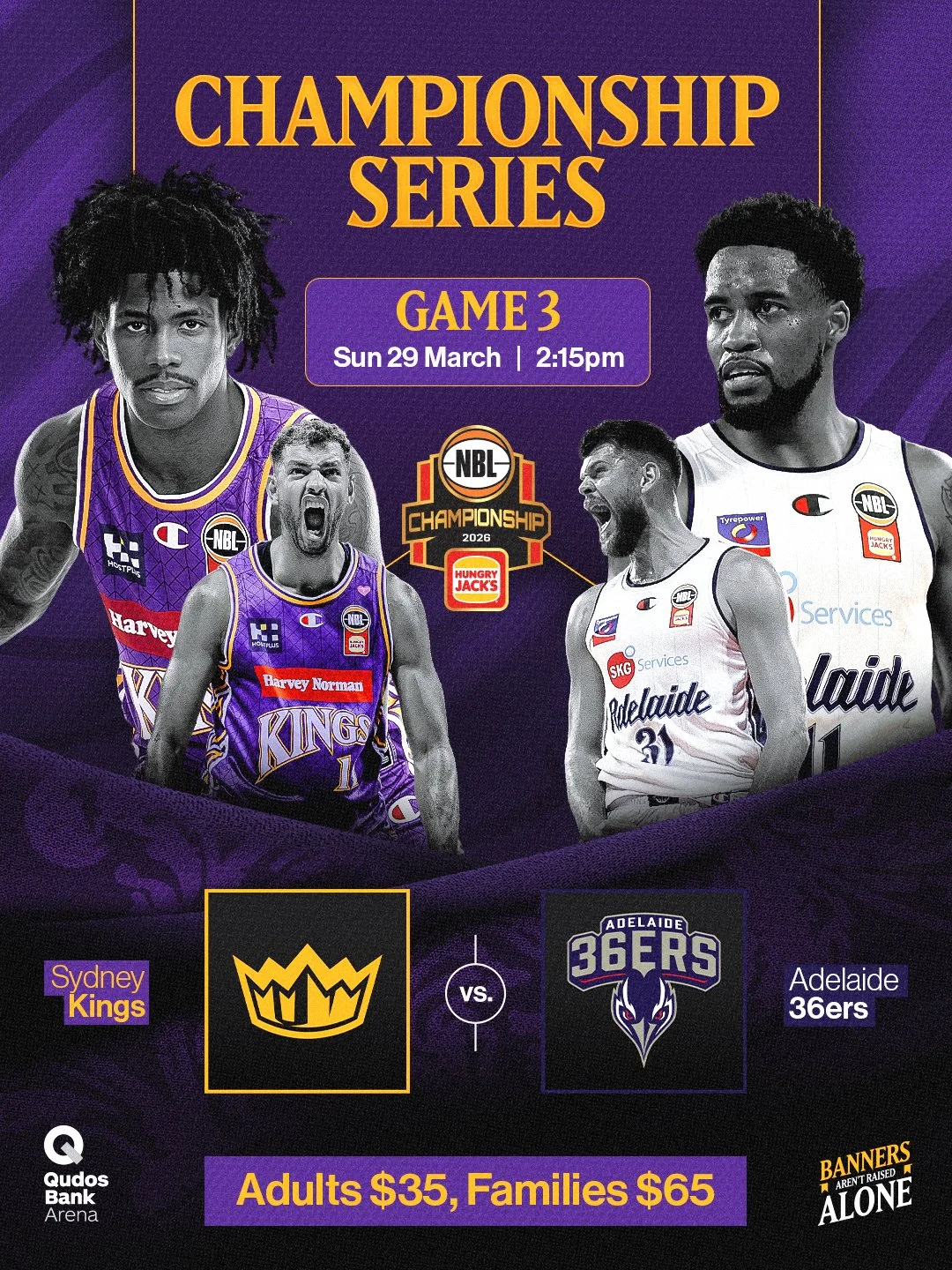
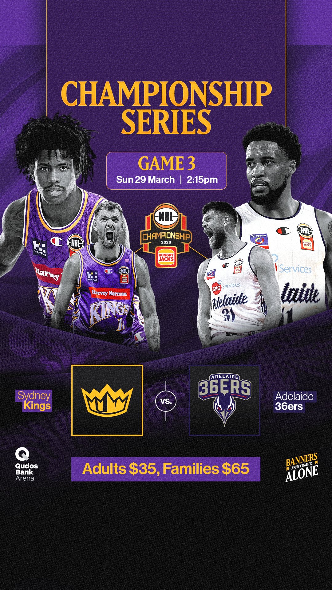
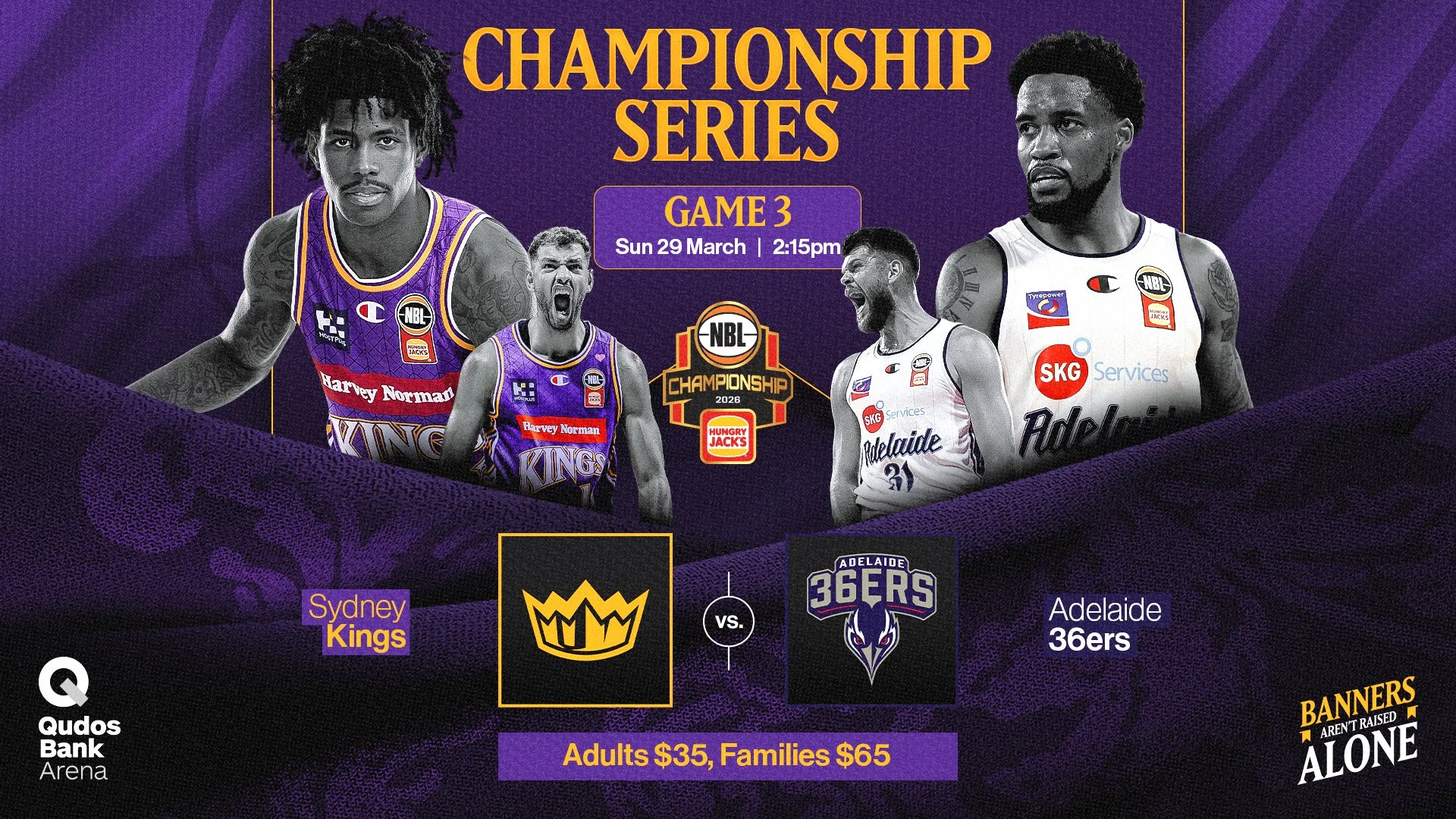
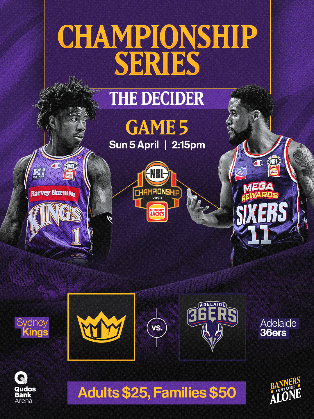
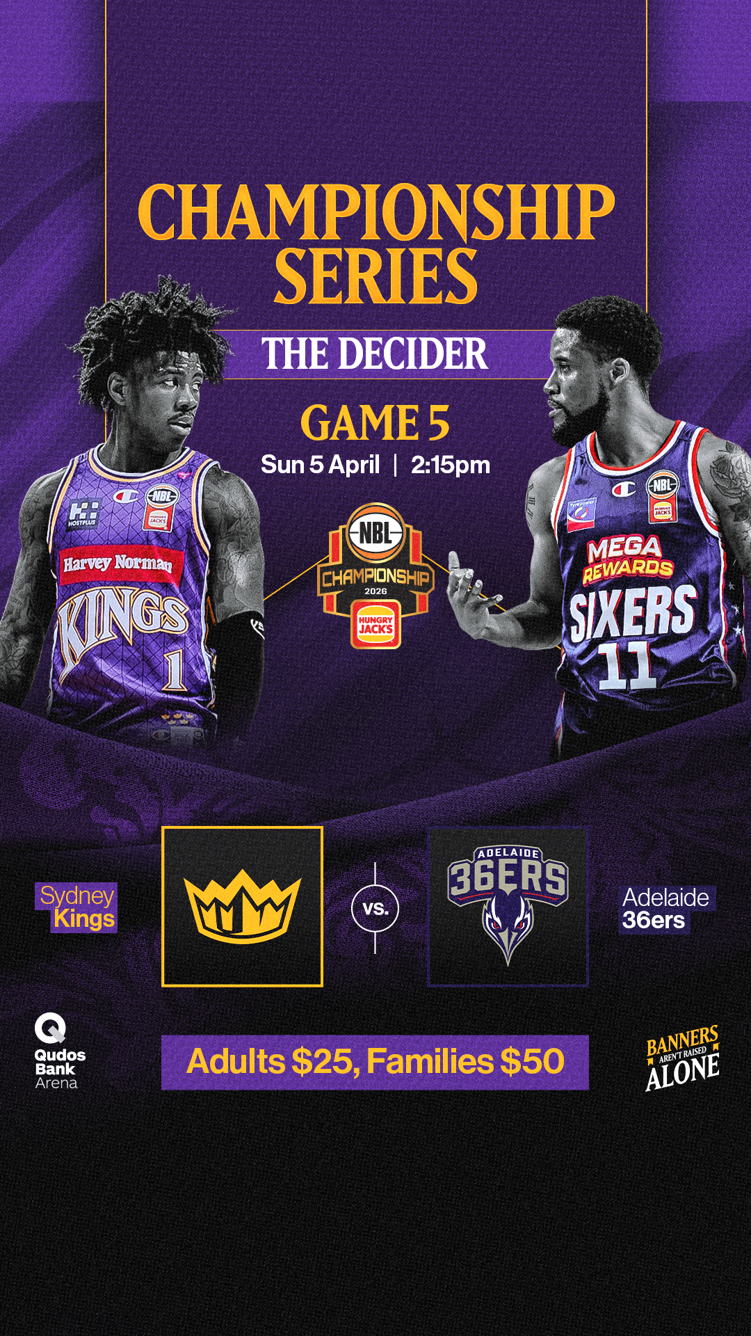
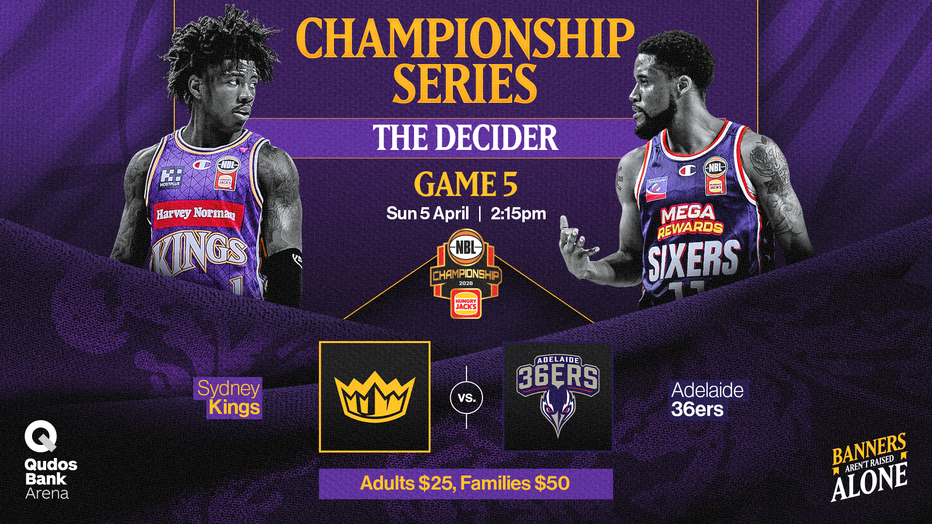
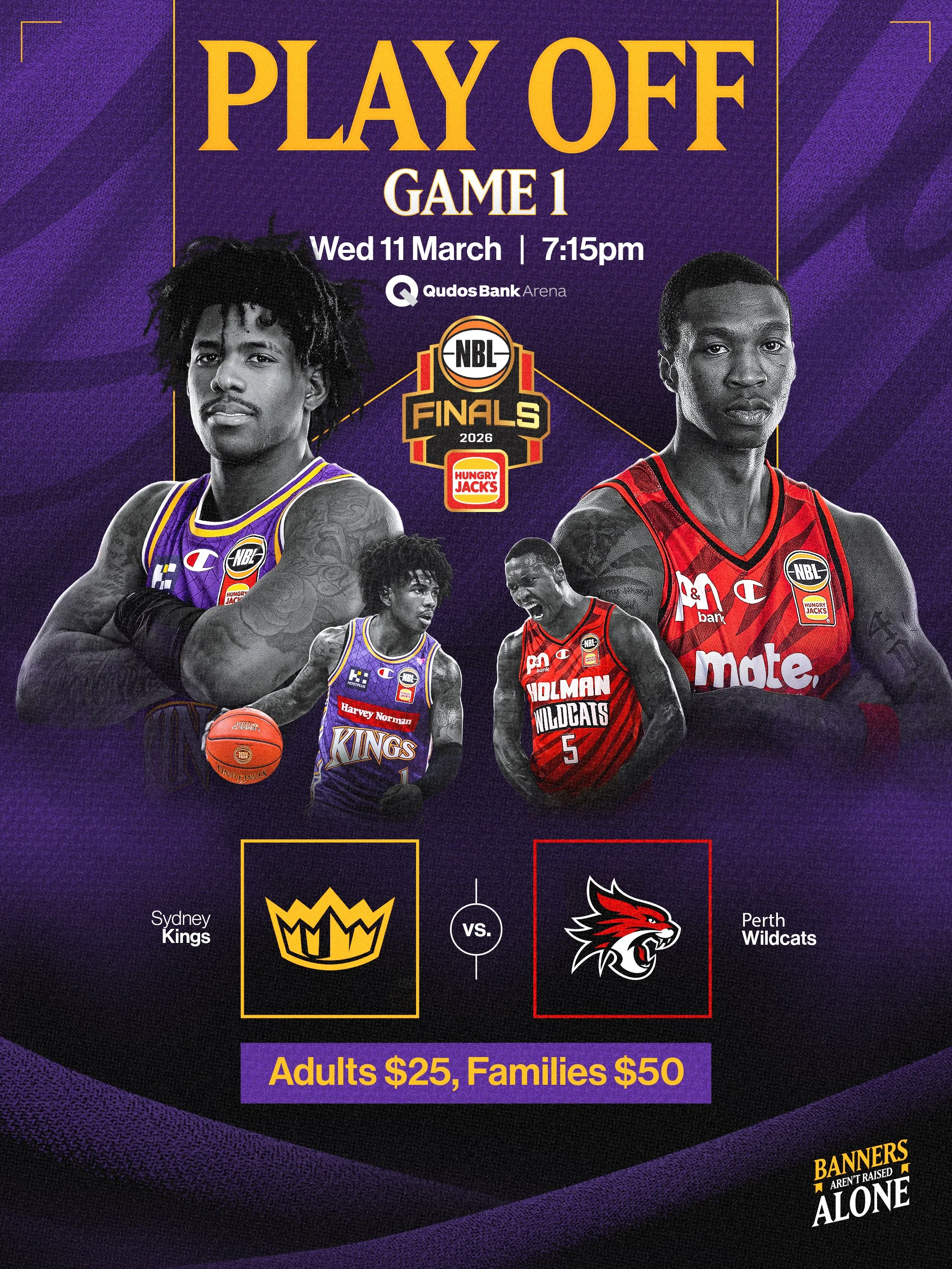
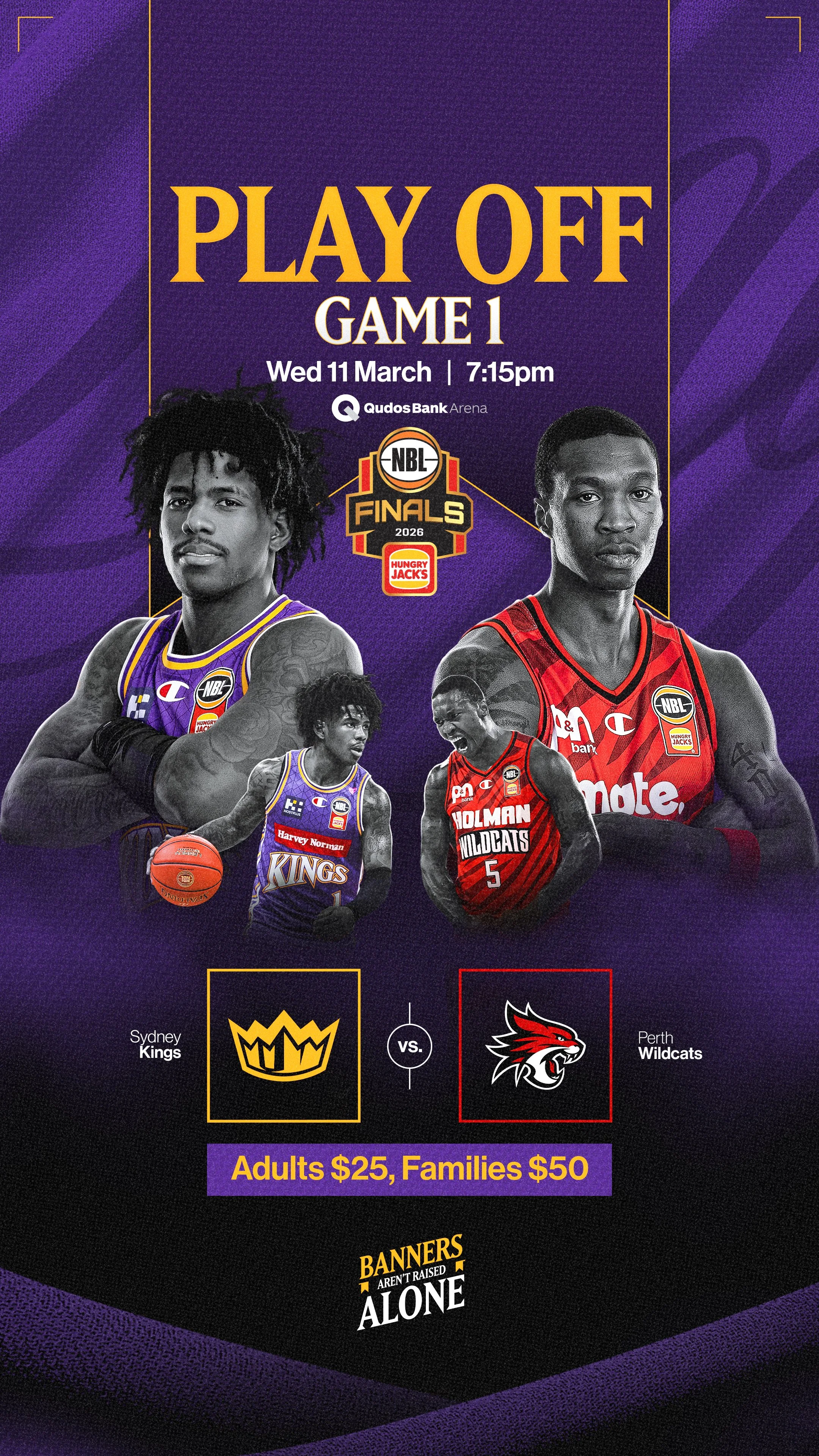
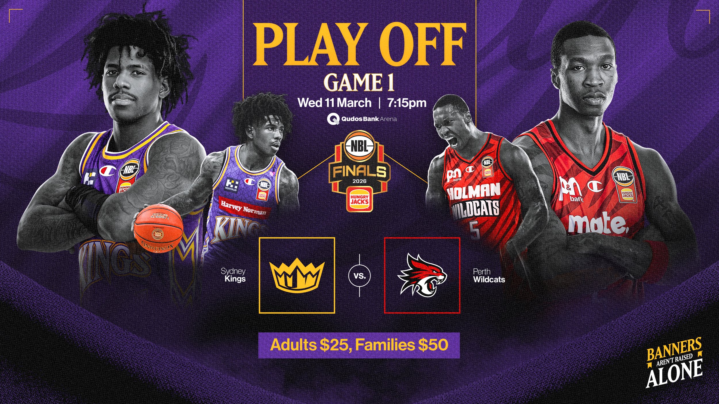
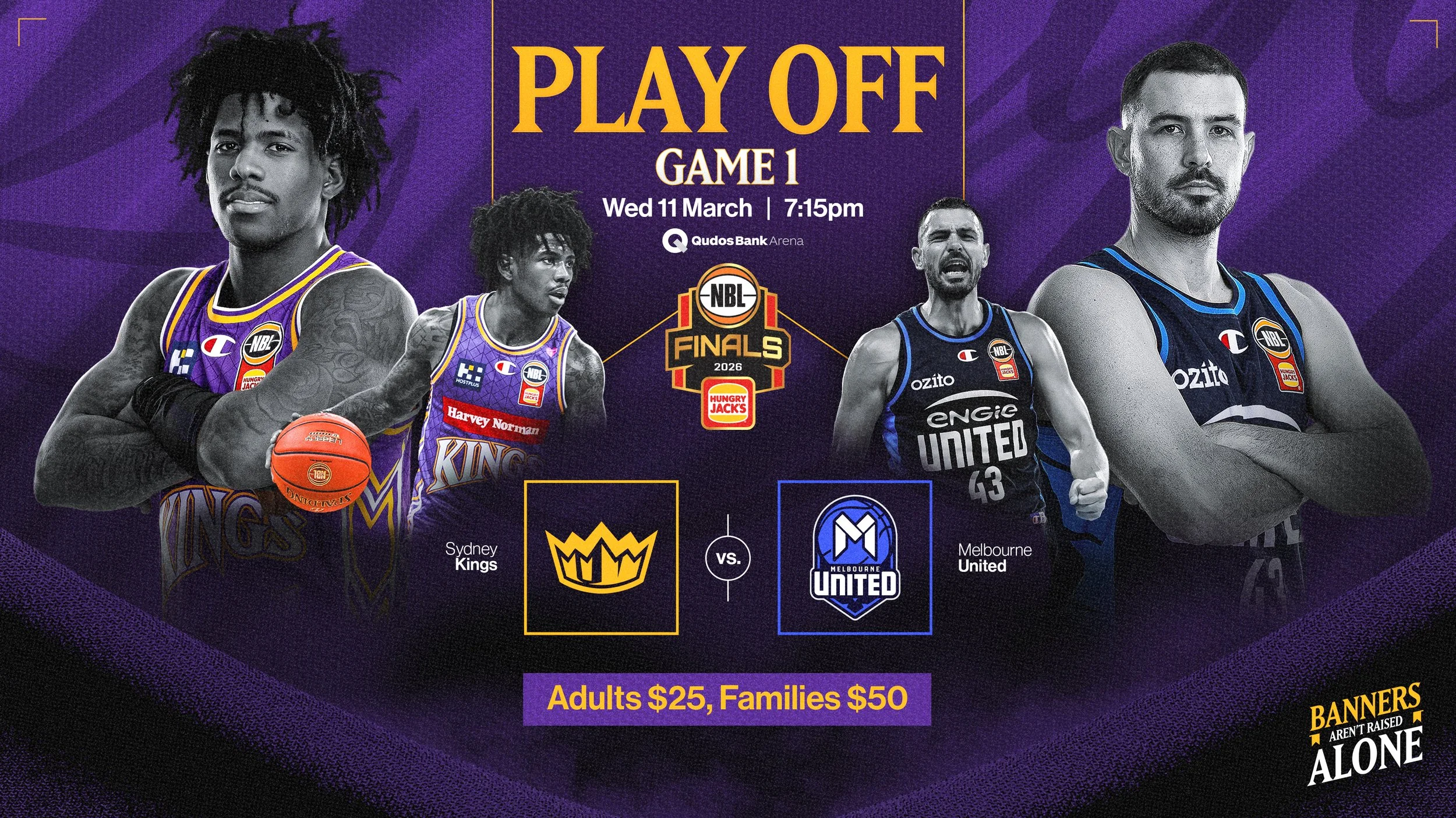
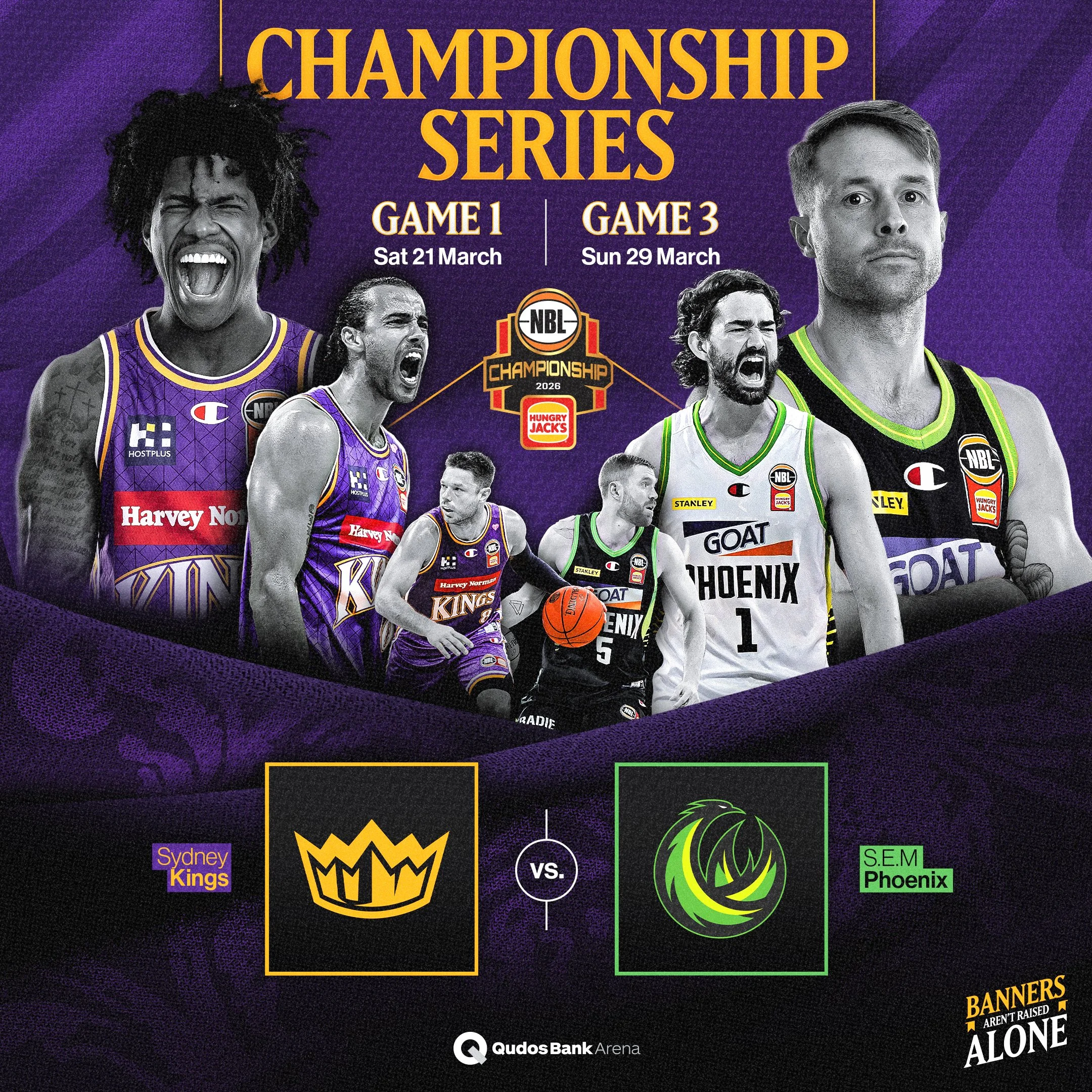
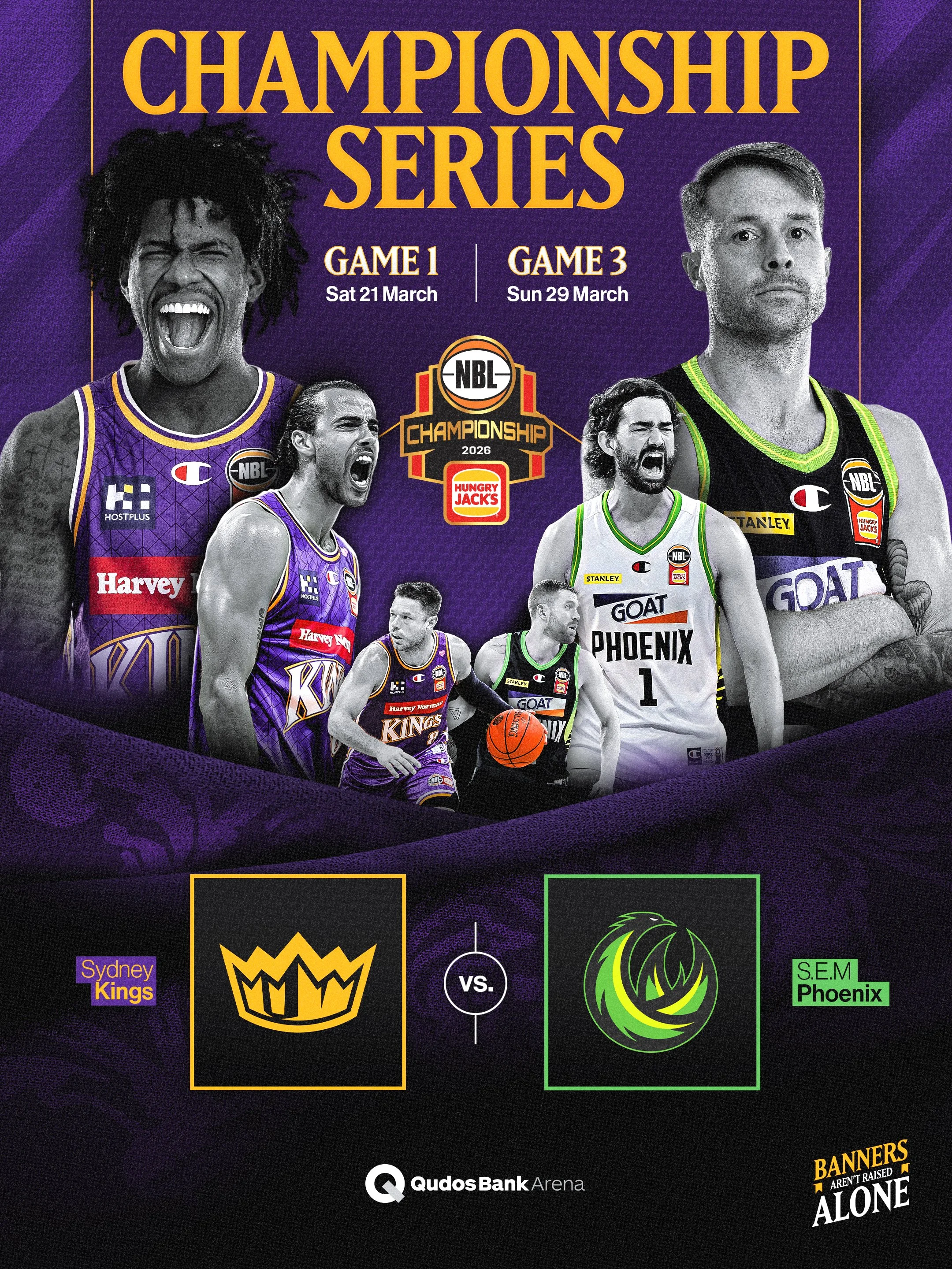
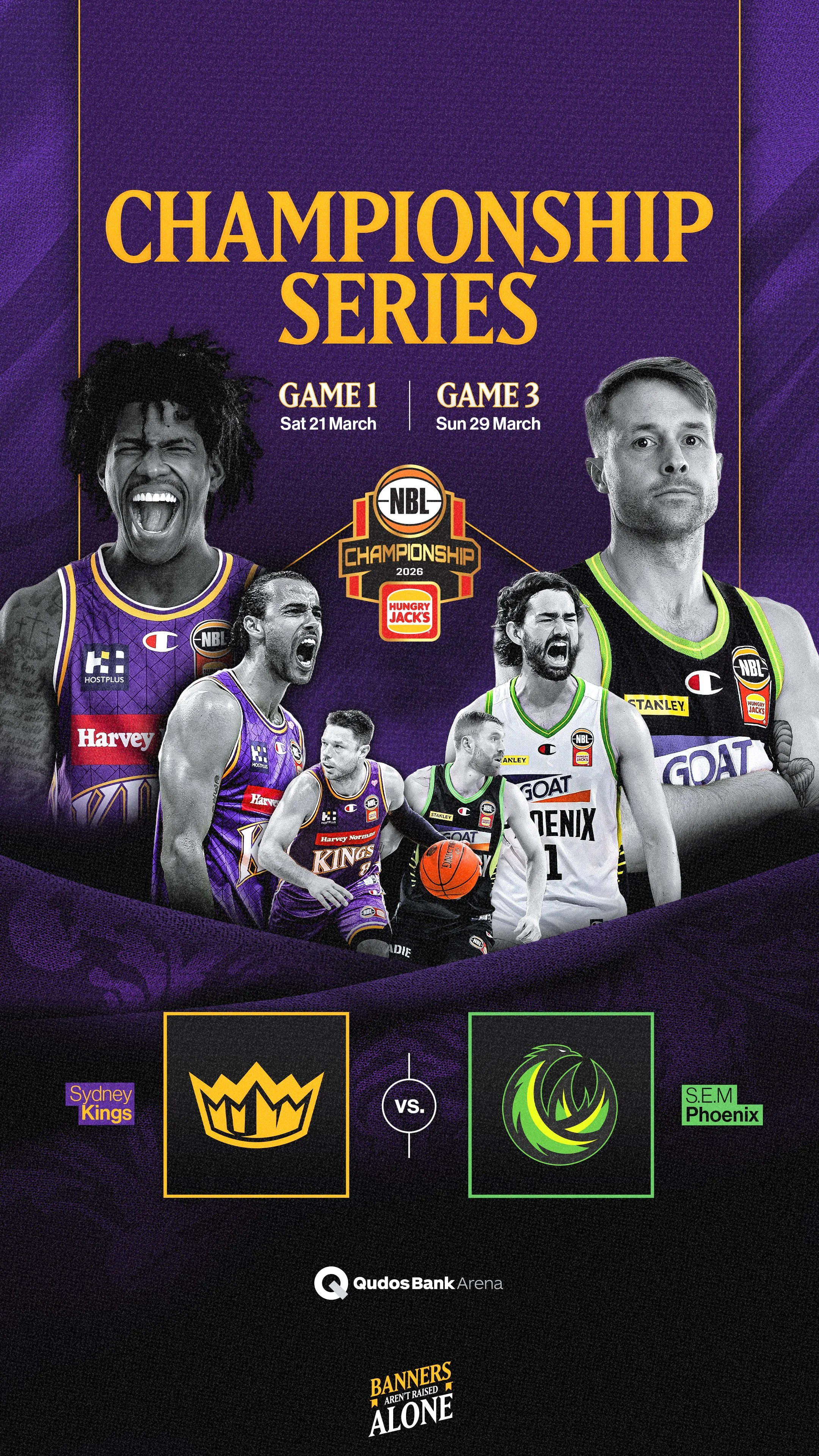
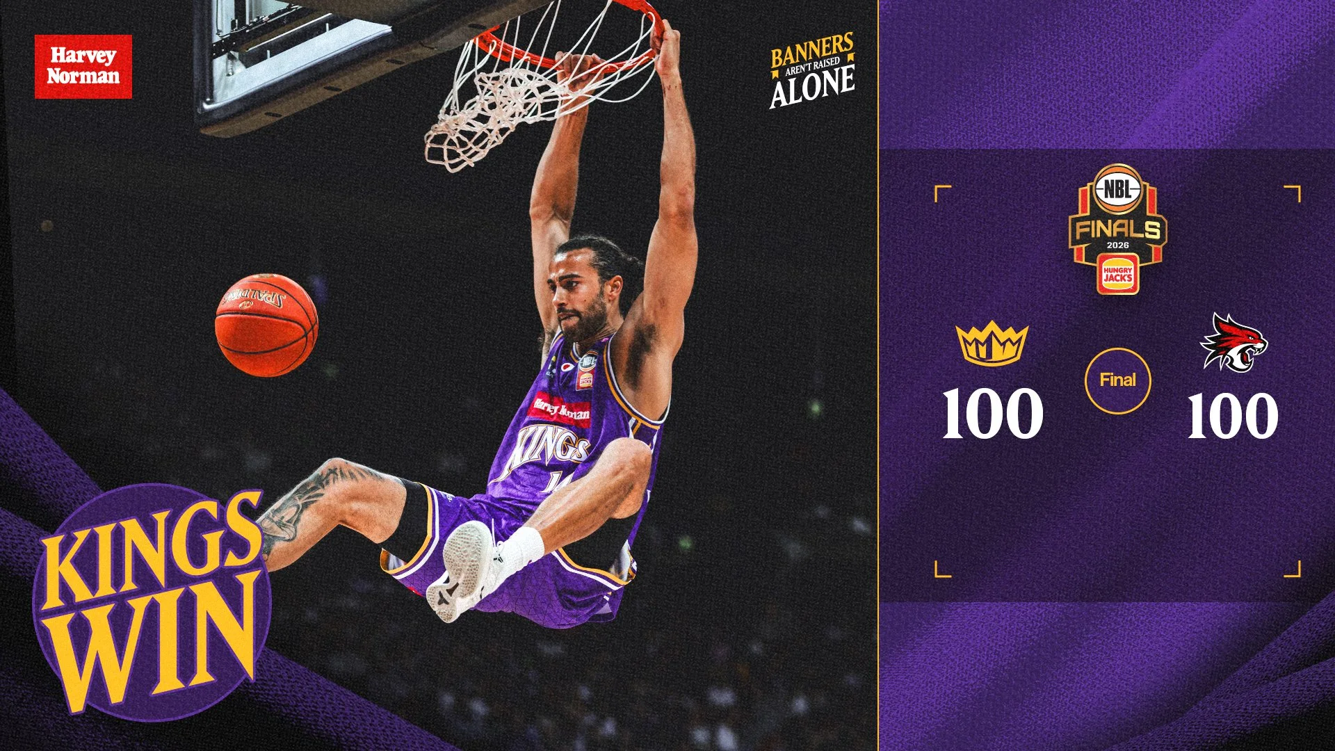
The banner theme formed the conceptual foundation of the territory. Player imagery was treated in monochrome for marketing assets, allowing the uniforms and selected brand elements to remain in colour, drawing focus to the jersey and reinforcing the club and city the players represented.
The initial creative territory was developed and launched in just over 1 week. As the Kings progressed, the elimination format required the campaign to expand in real time, with many assets briefed and delivered on the same day. Additional contingency creative was prepared for multiple possible outcomes, ensuring the club could respond immediately as each series unfolded.
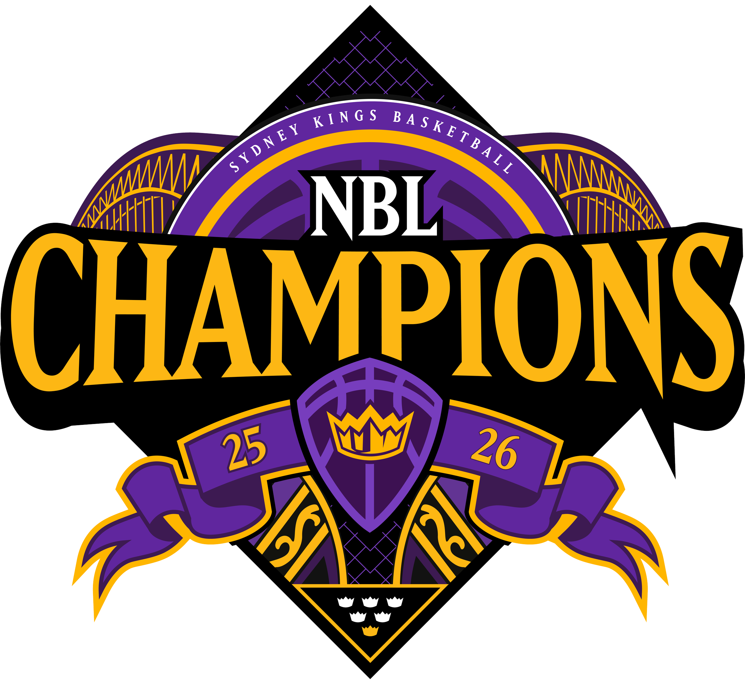
Deliverables included flyers, billboards, outdoor signage, Ticketek assets, Finals Series and playoff-exclusive merchandise, new game-day motion graphics and regular game-by-game content. I also built a dedicated Finals template suite for the Kings’ internal team, with the campaign culminating in a new Champions logo developed within a 2-day turnaround.
This campaign was delivered across the 26 days the Kings were in the NBL26 Finals Series.







In-Venue Motion
Finals Holding Screen
Championship Logo